
二维布局用 Grid
以下内容来自 CSS Tricks
Grid 也分 container 和 items
分别记忆
成为 container
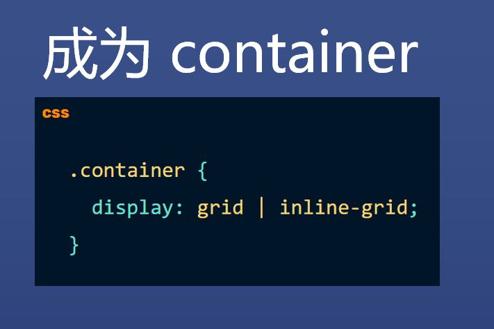
| .container { | |
| display: grid | inline-grid; | |
| } |
行和列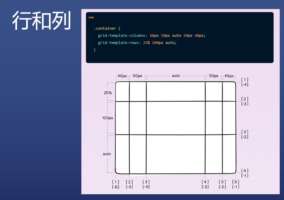
| .container { | |
| grid-template-columns: 40px 50px auto 50px 40px; | |
| grid-template-rows: 25% 100px auto; | |
| } |
给每条线起名字,方便后续选择
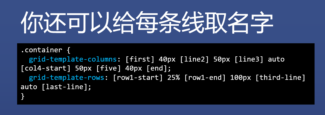
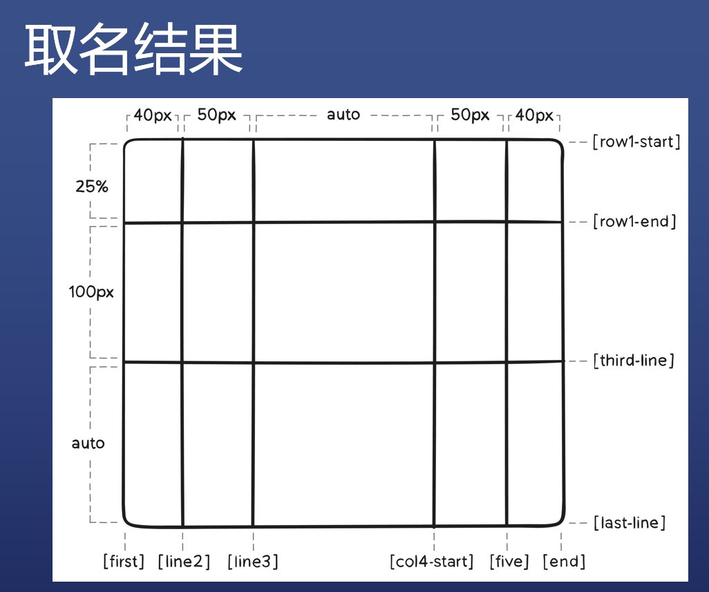
起名有啥用
- item 可以设置范围
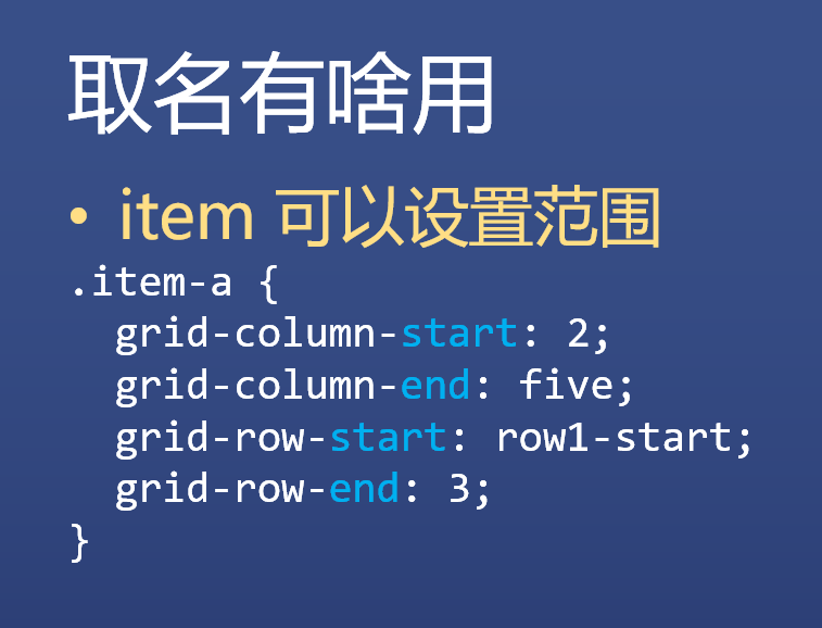
| .item-a { | |
| grid-column-start: 2; | |
| grid-column-end: five; | |
| grid-row-start: row1-start; | |
| grid-row-end: 3; | |
| } |
fr - free space 巧记:份
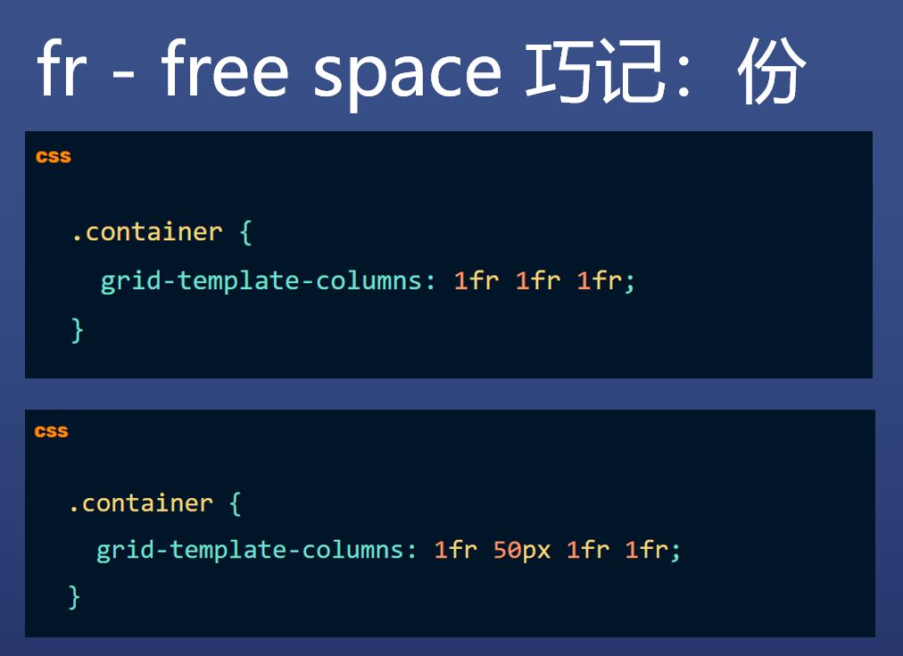
| .container { | |
| grid-template-columns: 1fr 1fr 1fr; | |
| } |
| .container { | |
| grid-template-columns: 1fr 50px 1fr 1fr; | |
| } |
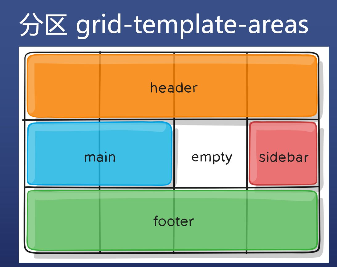
分区 grid-template-areas
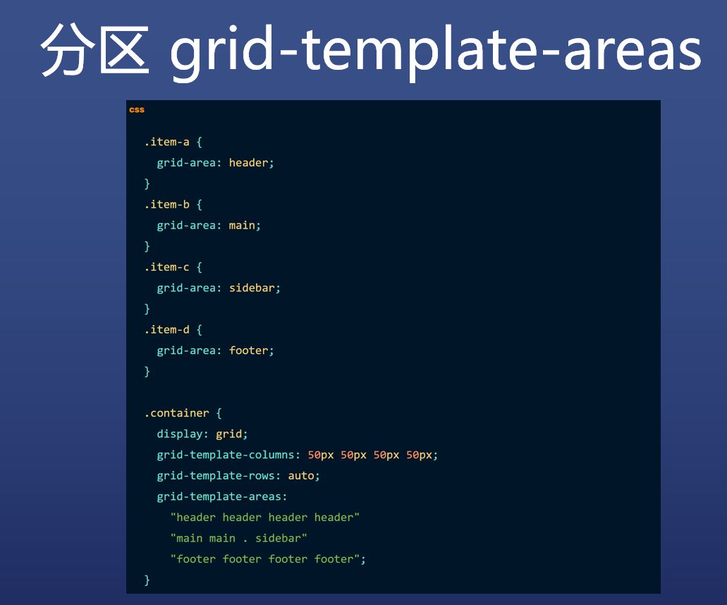
| .item-a { | |
| grid-area: header; | |
| } | |
| .item-b { | |
| grid-area: main; | |
| } | |
| .item-c { | |
| grid-area: sidebar; | |
| } | |
| .item-d { | |
| grid-area: footer; | |
| } | |
| .container { | |
| display: grid; | |
| grid-template-columns: 50px 50px 50px 50px; | |
| grid-template-rows: auto; | |
| grid-template-areas: | |
| "header header header header" | |
| "main main . sidebar" | |
| "footer footer footer footer"; | |
| } |
空隙 gap
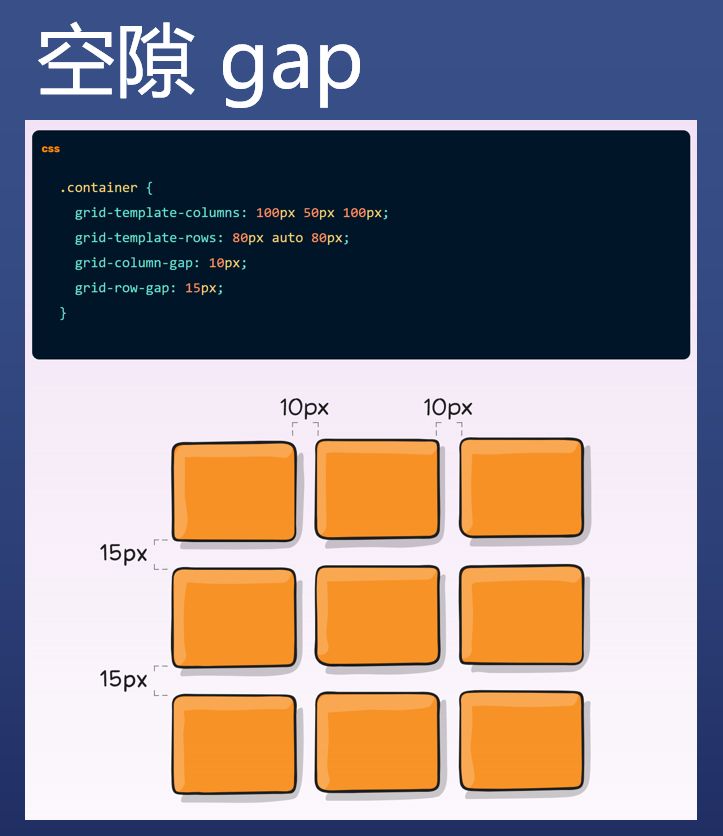
| .container { | |
| grid-template-columns: 100px 50px 100px; | |
| grid-template-rows: 80px auto 80px; | |
| grid-column-gap: 10px; | |
| grid-row-gap: 15px; | |
| } |
实践
布局
- Grid 尤其适合不规则布局
经验
- 等到 Grid 普及了,前端对 CSS 的要求会进一步降低
- 目前你简单尝试一下 Grid 就可以了
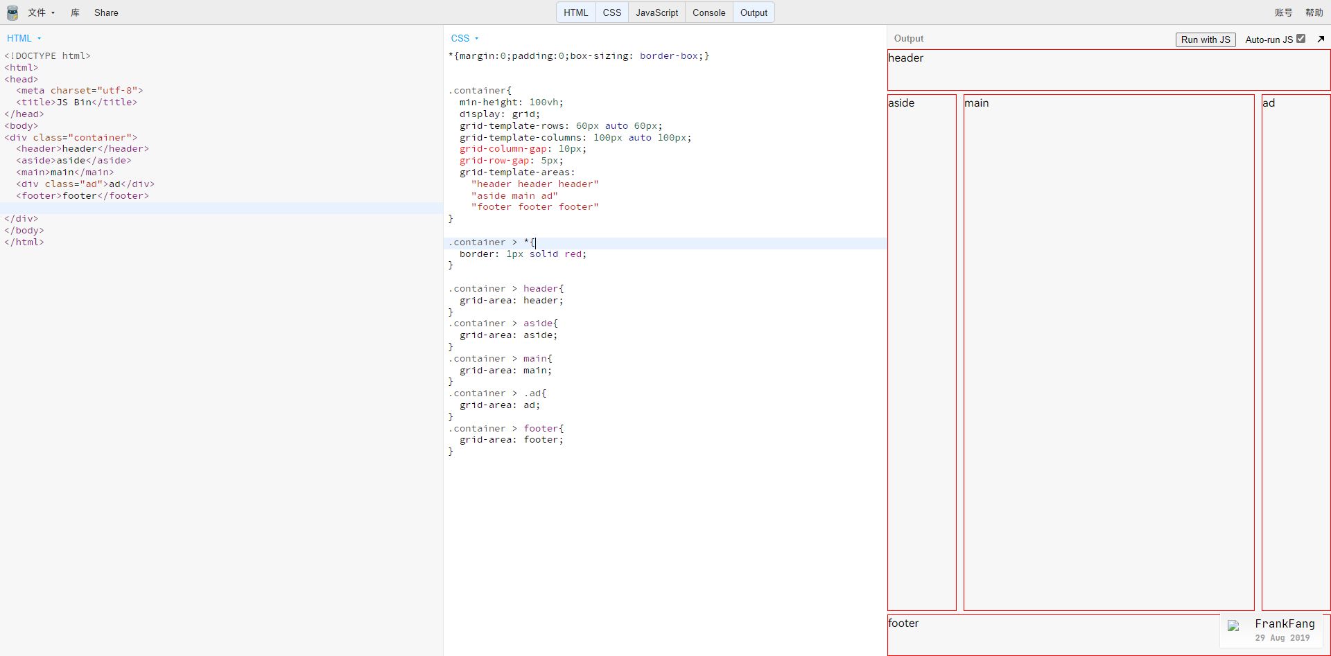
http://js.jirengu.com/tijuk/edit
淘宝电商页面布局模仿
资料来源:饥人谷。任何组织或个人未经许可,禁止转载
相关推荐


评论