打卡作业
| # Day09 作业布置 | |
| ## 一. 完成课堂所有的代码 | |
| ## 二. 总结绝对定位的相对元素以及常见的解决方案 | |
| ## 三. 总结浮动常见的规则内容 | |
| ## 四. 通过浮动练习页面布局方案 | |
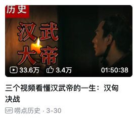
| ## 五. 完成下面的案例练习 | |
|  | |

Day08 作业布置
一. 完成课堂所有的代码
已完成
二. 说出结构伪类的nth-child和nth-of-type的区别,并且写出案例练习
:nth-child 只计算父元素的第几个子元素 ,不管是否是同种类型,也不会排除干扰项.
:nth-of-type 计数时只计算同种类型的元素,会排除所有的干扰项
| <html lang="en"> | |
| <head> | |
| <meta charset="UTF-8" /> | |
| <meta http-equiv="X-UA-Compatible" content="IE=edge" /> | |
| <meta name="viewport" content="width=device-width, initial-scale=1.0" /> | |
| <title>Document</title> | |
| <style> | |
| /* 获取box 的第3个div元素 */ | |
| .box div:nth-child(3) { | |
| color: red; | |
| } | |
| /* 父元素下的3个孩子 */ | |
| .box :nth-child(3) { | |
| color: pink; | |
| } | |
| /* 需求: 选择box中的第三个div元素(排除所有的干扰项) */ | |
| .box div:nth-of-type(3) { | |
| font-weight: 700; | |
| color: green; | |
| } | |
| .box div:nth-of-type(2n) { | |
| background-color: pink; | |
| } | |
| .box div:nth-of-type(2n + 1) { | |
| background-color: blue; | |
| } | |
| /* 前几个 */ | |
| .box div:nth-of-type(-n + 4) { | |
| color: purple; | |
| font-weight: 700; | |
| } | |
| /* 会找ul下的子元素同类型的第几个 */ | |
| ul :nth-of-type(3) { | |
| color: pink; | |
| } | |
| </style> | |
| </head> | |
| <body> | |
| <div class="box"> | |
| <div>第1个元素</div> | |
| <span>干扰项1</span> | |
| <span>干扰项2</span> | |
| <span>干扰项3</span> | |
| <span>干扰项4</span> | |
| <span>干扰项5</span> | |
| <div>第2个元素</div> | |
| <div>第3个元素</div> | |
| <div>第4个元素</div> | |
| <div>第5个元素</div> | |
| <div>第6个元素</div> | |
| <div>第7个元素</div> | |
| <div>第8个元素</div> | |
| <p>干扰项6</p> | |
| <div>第9个元素</div> | |
| <div>第10个元素</div> | |
| </div> | |
| <ul> | |
| <li>第1个li元素</li> | |
| <li>第2个li元素</li> | |
| <span>干扰项3</span> | |
| <span>干扰项4</span> | |
| <span>干扰项5</span> | |
| <li>第3个li元素</li> | |
| <li>第4个li元素</li> | |
| <li>第5个li元素</li> | |
| <li>第6个li元素</li> | |
| <li>第7个li元素</li> | |
| <li>第8个li元素</li> | |
| <li>第9个li元素</li> | |
| <li>第10个li元素</li> | |
| </ul> | |
| </body> | |
| </html> | |
三. 自己练习使用字体图标
从iconfont中下载图标练习
方式一 通过对应字体图标的Unicode来显示代码;
| <html lang="en"> | |
| <head> | |
| <meta charset="UTF-8" /> | |
| <meta http-equiv="X-UA-Compatible" content="IE=edge" /> | |
| <meta name="viewport" content="width=device-width, initial-scale=1.0" /> | |
| <title>Document</title> | |
| <style> | |
| /* 1.引入字体文件 */ | |
| @font-face { | |
| font-family: "iconfont"; | |
| src: url(./fonts03/iconfont.ttf); | |
| } | |
| /* 抽取公共类 */ | |
| .iconfont { | |
| font-family: "iconfont"; | |
| font-style: normal; | |
| } | |
| .person { | |
| display: inline-block; | |
| width: 100px; | |
| height: 100px; | |
| background-color: pink; | |
| font-size: 80px; | |
| } | |
| .gonchang::before { | |
| content: "\e98e"; | |
| display: inline-block; | |
| width: 300px; | |
| height: 300px; | |
| font-size: 80px; | |
| background-color: pink; | |
| } | |
| </style> | |
| </head> | |
| <body> | |
| <i class="iconfont">𐂭</i> | |
| <i class="iconfont person"></i> | |
| <i class="iconfont"></i> | |
| <i class="iconfont gonchang"></i> | |
| </body> | |
| </html> | |
- 方式二 利用已经编写好的class, 直接使用即可;
| <html lang="en"> | |
| <head> | |
| <meta charset="UTF-8" /> | |
| <meta http-equiv="X-UA-Compatible" content="IE=edge" /> | |
| <meta name="viewport" content="width=device-width, initial-scale=1.0" /> | |
| <title>Document</title> | |
| <link rel="stylesheet" href="./fonts03/iconfont.css" /> | |
| <style> | |
| .icon-hetong { | |
| display: inline-block; | |
| width: 40px; | |
| height: 40px; | |
| font-size: 30px; | |
| background-color: pink; | |
| } | |
| </style> | |
| </head> | |
| <body> | |
| <i class="iconfont icon-hetong"></i> | |
| </body> | |
| </html> | |
四. 自己找精灵图进行练习
| <html lang="en"> | |
| <head> | |
| <meta charset="UTF-8" /> | |
| <meta http-equiv="X-UA-Compatible" content="IE=edge" /> | |
| <meta name="viewport" content="width=device-width, initial-scale=1.0" /> | |
| <title>Document</title> | |
| <link rel="stylesheet" href="./css/reset.css" /> | |
| <style> | |
| .service { | |
| background: #eaeaea; | |
| border-bottom: 1px solid #666; | |
| margin-top: 200px; | |
| } | |
| .w { | |
| width: 1200px; | |
| margin: 0 auto; | |
| } | |
| .slogen { | |
| display: flex; | |
| align-items: center; | |
| height: 42px; | |
| padding: 30px 0 30px 55px; | |
| } | |
| .slogen .item { | |
| display: flex; | |
| flex: 1; | |
| align-items: center; | |
| height: 42px; | |
| line-height: 42px; | |
| font-size: 18px; | |
| font-weight: 700; | |
| color: #444; | |
| text-indent: 8px; | |
| } | |
| .slogen .icon { | |
| display: inline-block; | |
| width: 36px; | |
| height: 42px; | |
| background: url(../image/jd_sprite.png) no-repeat; | |
| } | |
| .slogen .more { | |
| background-position: 0 -192px; | |
| } | |
| .slogen .fast { | |
| background-position: -41px -192px; | |
| } | |
| .slogen .good { | |
| background-position: -82px -192px; | |
| } | |
| .slogen .cheap { | |
| background-position: -123px -192px; | |
| } | |
| </style> | |
| </head> | |
| <body> | |
| <div class="service"> | |
| <div class="w"> | |
| <ul class="slogen"> | |
| <li class="item"> | |
| <i class="icon more"></i> | |
| 品类齐全,轻松购物 | |
| </li> | |
| <li class="item"> | |
| <i class="icon fast"></i> | |
| 多仓直发,极速配送 | |
| </li> | |
| <li class="item"> | |
| <i class="icon good"></i> | |
| 正品行货,精致服务 | |
| </li> | |
| <li class="item"> | |
| <i class="icon cheap"></i> | |
| 天天低价,畅选无忧 | |
| </li> | |
| </ul> | |
| </div> | |
| </div> | |
| </body> | |
| </html> | |
五. 结合CSS元素定位,并且找出对应的练习案例(2个)
第一个模仿京东我的购物车
| <html lang="en"> | |
| <head> | |
| <meta charset="UTF-8" /> | |
| <meta http-equiv="X-UA-Compatible" content="IE=edge" /> | |
| <meta name="viewport" content="width=device-width, initial-scale=1.0" /> | |
| <link rel="stylesheet" href="./fonts/iconfont.css" /> | |
| <title>Document</title> | |
| <style> | |
| body { | |
| padding: 0; | |
| margin: 0; | |
| } | |
| a { | |
| text-decoration: none; | |
| font-size: 14px; | |
| } | |
| .shopping-cart { | |
| position: relative; | |
| width: 130px; | |
| height: 34px; | |
| line-height: 34px; | |
| text-align: center; | |
| border: 1px solid #eee; | |
| margin: 100px auto; | |
| } | |
| .shopping-cart .icon-gouwuche { | |
| color: #e1251b; | |
| font-size: 18px; | |
| font-weight: 700; | |
| margin-right: 10px; | |
| } | |
| .shopping-cart .my-cart { | |
| color: #e1251b; | |
| font-size: 14px; | |
| font-weight: 700; | |
| } | |
| .shopping-cart .num { | |
| position: absolute; | |
| left: 27px; | |
| top: 2px; | |
| display: inline-block; | |
| width: 12px; | |
| text-align: center; | |
| line-height: 12px; | |
| padding: 1px 3px; | |
| font-size: 12px; | |
| border-radius: 7px; | |
| color: #fff; | |
| background-color: #e1251b; | |
| font-style: normal; | |
| } | |
| </style> | |
| </head> | |
| <body> | |
| <div class="shopping-cart"> | |
| <i class="icon-gouwuche iconfont"></i> | |
| <a href="#" class="my-cart">我的购物车</a> | |
| <i class="num">0</i> | |
| </div> | |
| </body> | |
| </html> | |
第二个模仿B站头部服务列表
| <html lang="en"> | |
| <head> | |
| <meta charset="UTF-8" /> | |
| <meta http-equiv="X-UA-Compatible" content="IE=edge" /> | |
| <meta name="viewport" content="width=device-width, initial-scale=1.0" /> | |
| <title>Document</title> | |
| <link rel="stylesheet" href="./css/reset.css" /> | |
| <link rel="stylesheet" href="./fonts02/iconfont.css" /> | |
| <style> | |
| .list { | |
| width: 300px; | |
| height: 50px; | |
| color: #fff; | |
| background-color: #ccc; | |
| margin: 30px auto; | |
| } | |
| .list .item { | |
| float: left; | |
| width: 50px; | |
| } | |
| .list .item .outside { | |
| position: relative; | |
| display: flex; | |
| flex-direction: column; | |
| justify-content: center; | |
| align-items: center; | |
| width: 50px; | |
| height: 50px; | |
| font-size: 10px; | |
| color: #fff; | |
| } | |
| .list .item .outside .icon { | |
| display: inline-block; | |
| width: 22px; | |
| height: 23px; | |
| font-size: 20px; | |
| } | |
| .list .item .outside .message { | |
| position: absolute; | |
| top: -1px; | |
| right: 5px; | |
| width: 15px; | |
| height: 15px; | |
| line-height: 15px; | |
| text-align: center; | |
| font-size: 12px; | |
| color: #fff; | |
| border-radius: 7px; | |
| background-color: #fa5a57; | |
| } | |
| </style> | |
| </head> | |
| <body> | |
| <ul class="list"> | |
| <li class="item"> | |
| <a href="#" class="outside"> | |
| <i class="iconfont icon-wodedahuiyuan icon"></i> | |
| <span class="text">大会员</span> | |
| </a> | |
| </li> | |
| <li class="item"> | |
| <a href="#" class="outside"> | |
| <i class="iconfont icon-xiaoxi icon"></i> | |
| <div class="message">2</div> | |
| <span class="text">消息</span> | |
| </a> | |
| </li> | |
| <li class="item"> | |
| <a href="#" class="outside"> | |
| <i class="iconfont icon-fengche icon"></i> | |
| <div class="message">3</div> | |
| <span class="text">动态</span> | |
| </a> | |
| </li> | |
| <li class="item"> | |
| <a href="#" class="outside"> | |
| <i class="iconfont icon-shoucang icon"></i> | |
| <span class="text">收藏</span> | |
| </a> | |
| </li> | |
| <li class="item"> | |
| <a href="#" class="outside"> | |
| <i class="iconfont icon-lishi icon"></i> | |
| <span class="text">历史</span> | |
| </a> | |
| </li> | |
| <li class="item"> | |
| <a href="#" class="outside"> | |
| <i class="iconfont icon-dengpao icon"></i> | |
| <span class="text">创作中心</span> | |
| </a> | |
| </li> | |
| </ul> | |
| </body> | |
| </html> |
务必下载!!
今日的代码和讲义 以及思维导图:【点击此链接下载 Day09.zip】
一. 绝对定位(absolute)
1.1. 绝对定位(重点)
| 1.会脱离标准流 | |
| 2.相对的参照对象 | |
| * 最近的祖先定位元素; | |
| * 如果祖先元素都没有定位, 相对视口 | |
| 3.子绝父相 | |
| * 子元素绝对定位 | |
| * 父元素相对定位 | |
| 4.子绝父绝 | |
| * 子元素绝对定位 | |
| * 父元素绝对定位 | |
| 5.子绝父固 | |
| * 子元素绝对定位 | |
| * 父元素固定定位 |
- 元素脱离
normal flow(脱离标准流、脱标) - 可以通过
left、right、top、bottom进行定位- 定位参照对象是最邻近的定位祖先元素
- 如果找不到这样的祖先元素,参照对象是视口
- 定位元素(
positioned element)position值不为static的元素- 也就是
position值为relative、absolute、fixed的元素
子绝父相(了解)
- 在绝大数情况下,子元素的绝对定位都是相对于父元素进行定位
- 如果希望子元素相对于父元素进行定位,又不希望父元素脱标,常用解决方案是:
- 父元素设置
position: relative(让父元素成为定位元素,而且父元素不脱离标准流) - 子元素设置
position: absolute - 简称为“子绝父相”
- 当然,也有 子绝父绝 子绝父固 不要死记
- 父元素设置
1.2. position设置absolute/fixed特性
| 1.都是脱离标准流 | |
| 2.可以任何设置宽度和高度 | |
| 3.默认宽度高度是包裹内容 | |
| 4.不再给父级元素汇报宽度和高度 | |
| 5.自己内部依然按照标准流布局 | |
| 6.公式 | |
| * 包含块的width = left + right + margin-left + margin-right + width | |
| * left0 right0 margin 0 auto width: 200px -> 水平居中 | |
| * left 0 right 0 margin 0 -> 宽度沾满包含块的宽度 | |
| * 垂直方向也是一样 | |
| * 俺也一样 |
将position设置为absolute/fixed元素的特点
可以随意设置宽高
宽高默认由内容决定
不再受标准流的约束
- 不再
严格按照从上到下、从左到右排布 - 不再
严格区分块级(block)、行内级(inline),行内块级(inline-block)的很多特性都会消失
- 不再
不再给父元素汇报宽高数据
脱标元素内部默认还是按照标准流布局
绝对定位元素(
absolutely positioned element)position值为absolute或者fixed的元素
对于绝对定位元素来说
- 定位参照对象的宽度 =
left + right + margin-left + margin-right + 绝对定位元素的实际占用宽度 - 定位参照对象的高度 =
top + bottom + margin-top + margin-bottom + 绝对定位元素的实际占用高度
- 定位参照对象的宽度 =
如果希望绝对定位元素的宽高和定位参照对象一样,可以给绝对定位元素设置以下属性
left: 0、right: 0、top: 0、bottom: 0、margin:0
如果希望绝对定位元素在定位参照对象中居中显示,可以给绝对定位元素设置以下属性
left: 0、right: 0、top: 0、bottom: 0、margin: auto- 另外,还得
设置具体的宽高值(宽高小于定位参照对象的宽高)
auto到底是什么?
800 = 200 + ml0 + mr0 + 0 + 0auto-> 交给浏览器你来出来width: auto;- 1.行内非替换元素 ->
width: 包裹内容 - 2.块级元素 ->
width: 包含块的宽度 - 3.绝对定位元素 ->
width: 包裹内容
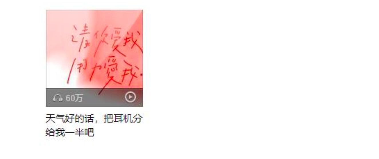
1.3. 绝对定位案例
| 网易云item的练习 | |
| * 基本布局 | |
| * 背景 | |
| * 绝对定位 |
- 这个案例看似简单, 但是里面涉及的知识点非常多
- 按照自己的思路一步步布局即可, 不要着急;
- 1.慢点做, 不要着急
- 2.如果有些东西做不出来, 去回顾之前的知识
- 3.多参考的代码
| <html lang="en"> | |
| <head> | |
| <meta charset="UTF-8"> | |
| <meta http-equiv="X-UA-Compatible" content="IE=edge"> | |
| <meta name="viewport" content="width=device-width, initial-scale=1.0"> | |
| <title>Document</title> | |
| <style> | |
| /* 重置代码 */ | |
| a { | |
| text-decoration: none; | |
| color: #333; | |
| } | |
| /* 公共的CSS */ | |
| .sprite_01 { | |
| background-image: url(https://img.onmicrosoft.cn/micro-code-images/music_sprite_01.png); | |
| display: inline-block; | |
| } | |
| .sprite_02 { | |
| background-image: url(https://img.onmicrosoft.cn/micro-code-images/music_sprite_02.png); | |
| display: inline-block; | |
| } | |
| .sprite_02_icon_music { | |
| width: 14px; | |
| height: 11px; | |
| background-position: 0 -24px; | |
| } | |
| .sprite_02_icon_play { | |
| width: 16px; | |
| height: 17px; | |
| background-position: 0 0; | |
| } | |
| /* 布局代码 */ | |
| .item { | |
| width: 140px; | |
| margin: 0 auto; | |
| } | |
| .item .top { | |
| position: relative; | |
| } | |
| .item .top img { | |
| /* 将图片下面的多出来的区域去除 */ | |
| vertical-align: top; | |
| /* display: block; */ | |
| } | |
| .item .top .cover { | |
| position: absolute; | |
| top: 0; | |
| bottom: 0; | |
| left: 0; | |
| right: 0; | |
| background-image: url(https://img.onmicrosoft.cn/micro-code-images/music_sprite_01.png); | |
| background-position: 0 0; | |
| } | |
| .item .top .info { | |
| position: absolute; | |
| bottom: 0; | |
| left: 0; | |
| right: 0; | |
| height: 27px; | |
| padding-left: 10px; | |
| line-height: 27px; | |
| font-size: 12px; | |
| color: #ccc; | |
| background-image: url(https://img.onmicrosoft.cn/micro-code-images/music_sprite_01.png); | |
| background-position: 0 -537px; | |
| } | |
| .item .top .info .icon-music { | |
| position: relative; | |
| top: 1px; | |
| /* display: inline-block; */ | |
| /* width: 14px; | |
| height: 11px; */ | |
| /* background-image: url(https://img.onmicrosoft.cn/micro-code-images/music_sprite_02.png); */ | |
| /* background-position: 0 -24px; */ | |
| } | |
| .item .top .info .count { | |
| margin-left: 4px; | |
| } | |
| .item .top .info .icon-play { | |
| position: absolute; | |
| top: 0; | |
| bottom: 0; | |
| right: 10px; | |
| margin: auto 0; | |
| /* display: inline-block; */ | |
| /* width: 16px; | |
| height: 17px; */ | |
| /* background-image: url(https://img.onmicrosoft.cn/micro-code-images/music_sprite_02.png); */ | |
| /* background-position: 0 0; */ | |
| } | |
| /* 底部的样式 */ | |
| .item .bottom { | |
| display: block; | |
| margin-top: 8px; | |
| font-size: 14px; | |
| } | |
| .item .bottom:hover { | |
| text-decoration: underline; | |
| } | |
| </style> | |
| </head> | |
| <body> | |
| <div class="item"> | |
| <div class="top"> | |
| <img src="https://img.onmicrosoft.cn/micro-code-images/music_album01.jpg" alt="音乐封面"> | |
| <a class="cover" href="#"></a> | |
| <div class="info"> | |
| <i class="sprite_02 sprite_02_icon_music icon-music"></i> | |
| <span class="count">62万</span> | |
| <i class="sprite_02 sprite_02_icon_play icon-play"></i> | |
| </div> | |
| </div> | |
| <a class="bottom" href="#"> | |
| 天气好的话,把耳机分给我一半吧 | |
| </a> | |
| <i class="sprite_02 sprite_02_icon_play"></i> | |
| <i class="sprite_02 sprite_02_icon_music"></i> | |
| </div> | |
| </body> | |
| </html> |
1.4. 粘性定位 sticky
| * 基本演练 | |
| * 默认相对定位 | |
| * top: 0 -> 固定(绝对) | |
| * top/bottom/left/right -> 最近的滚动视口 |
- 另外还有一个定位的值是
position: sticky,比起其他定位值要新一些.- sticky是一个大家期待已久的属性;
- 可以看做是
相对定位和固定(绝对)定位的结合体; - 它允许被定位的元素
表现得像相对定位一样,直到它滚动到某个阈值点; - 当
达到这个阈值点时, 就会变成固定(绝对)定位;
sticky是相对于最近的滚动祖先包含滚动视口的( the nearest ancestor scroll container’s scrollport )
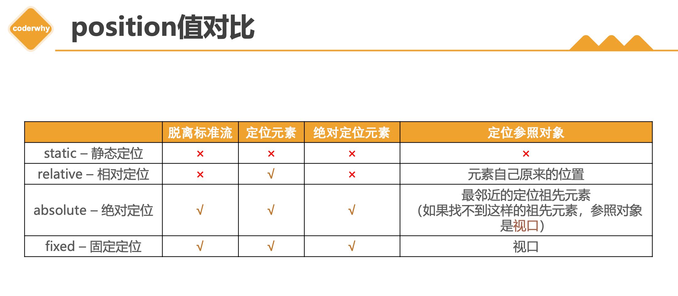
1.5. position多个值总结
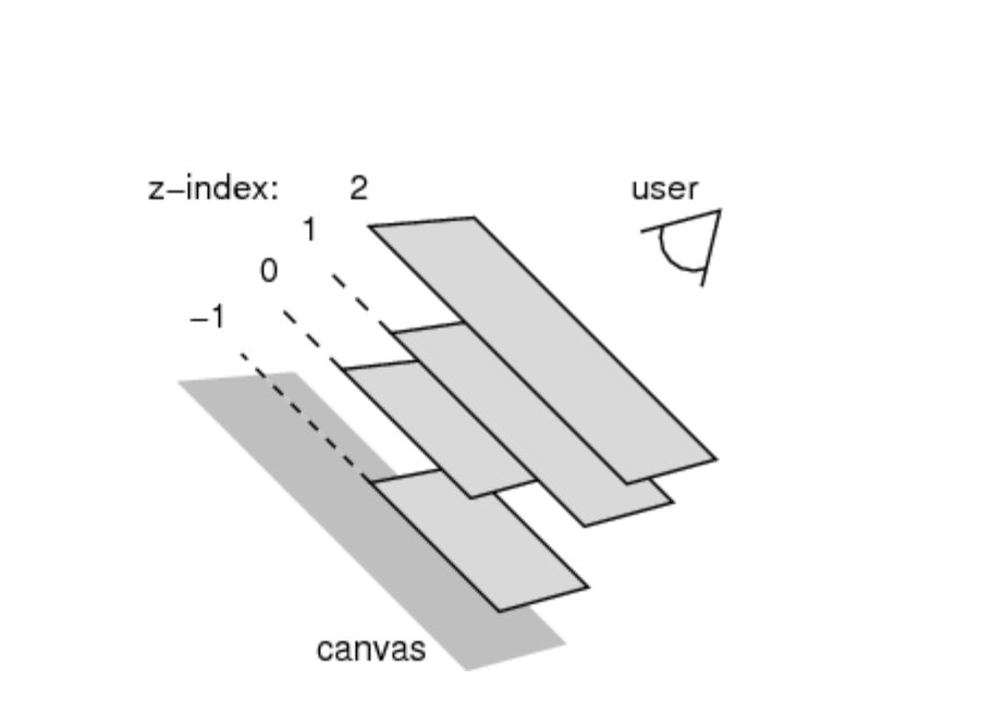
1.6. z-index
| * 只对定位元素有效 | |
| * 兄弟比较 |
- z-index属性用来设置定位元素的层叠顺序(仅对定位元素有效)
- 取值可以是正整数、负整数、0
- 比较原则
- 如果是
兄弟关系- ✓
z-index越大,层叠在越上面 - ✓
z-index相等,写在后面的那个元素层叠在上面
- ✓
- 如果
不是兄弟关系- ✓ 各自
从元素自己以及祖先元素中,找出最邻近的2个定位元素进行比较 - ✓ 而且
这2个定位元素必须有设置z-index的具体数值
- ✓ 各自
- 如果是
二. 浮动
2.1. 认识浮动
| float | |
| * none | |
| * left | |
| * right |
float属性可以指定一个元素应沿其容器的左侧或右侧放置,允许文本和内联元素环绕它。- float 属性最初只用于在一段文本内
浮动图像,实现文字环绕的效果; - 但是
早期的CSS标准中并没有提供好的左右布局方案, 因此在一段时间里面它成为网页多列布局的最常用工具;
- float 属性最初只用于在一段文本内
- 绝对定位、浮动都会让元素脱离标准流,以达到灵活布局的效果
- 可以通过
float属性让元素产生浮动效果,float的常用取值none:不浮动,默认值left:向左浮动right:向右浮动
2.2. 浮动规则
| * 规则一: 向左浮动或者向右浮动 | |
| * 规则二: 不能超出包含块; | |
| * 规则三: 浮动元素不能层叠 | |
| * 规则四: 浮动元素会将行内级元素内容推出 | |
| * 图文环绕效果 | |
| * 规则五: 浮动只能左右浮动, 不能超出本行的高度 |
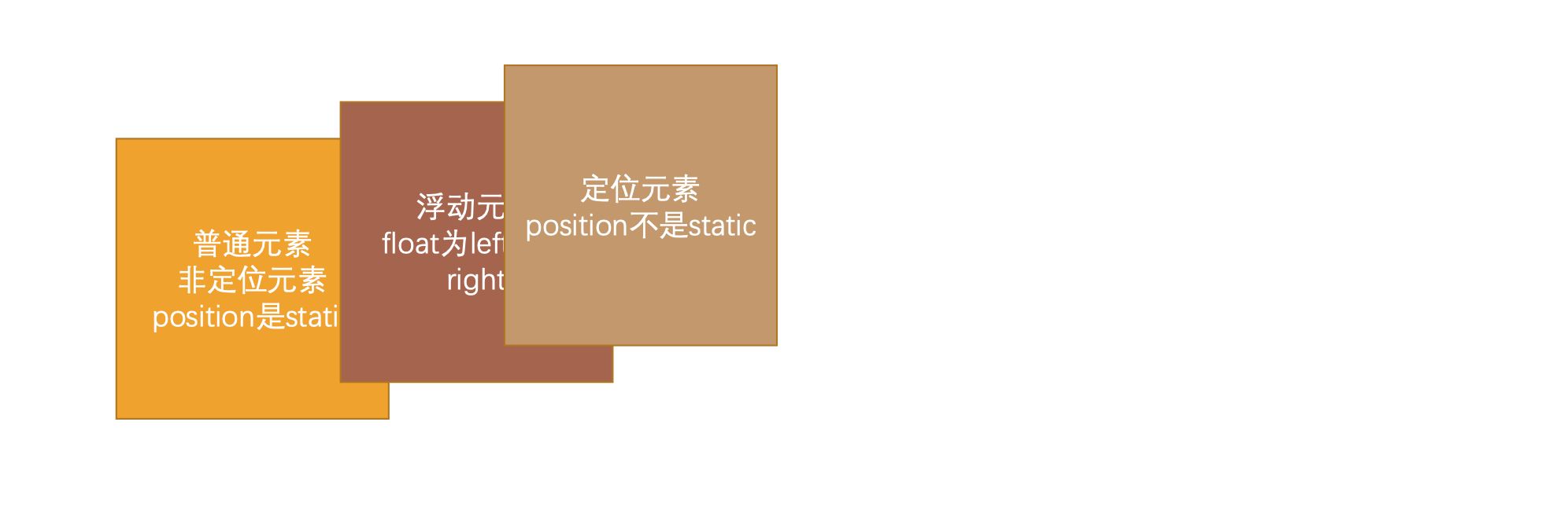
浮动规则一
- 元素一旦浮动后, 脱离标准流
朝着向左或向右方向移动,直到自己的边界紧贴着包含块(一般是父元素)或者其他浮动元素的边界为止定位元素会层叠在浮动元素上面
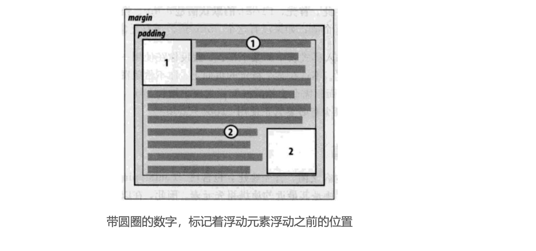
浮动规则二
- 如果元素是向左(右)浮动,浮动元素的左(右)边界不能超出
包含块的左(右)边界
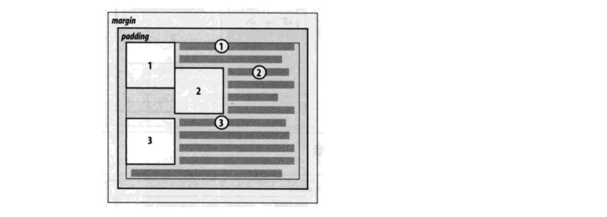
浮动规则三
- 规则三: 浮动元素之间不能层叠
- 如果一个元素浮动,另一个浮动元素已经在那个位置了,后浮动的元素将紧贴着前一个浮动元素(左浮找左浮,右浮找右浮)
- 如果水平方向剩余的空间不够显示浮动元素,浮动元素将向下移动,直到有充足的空间为止
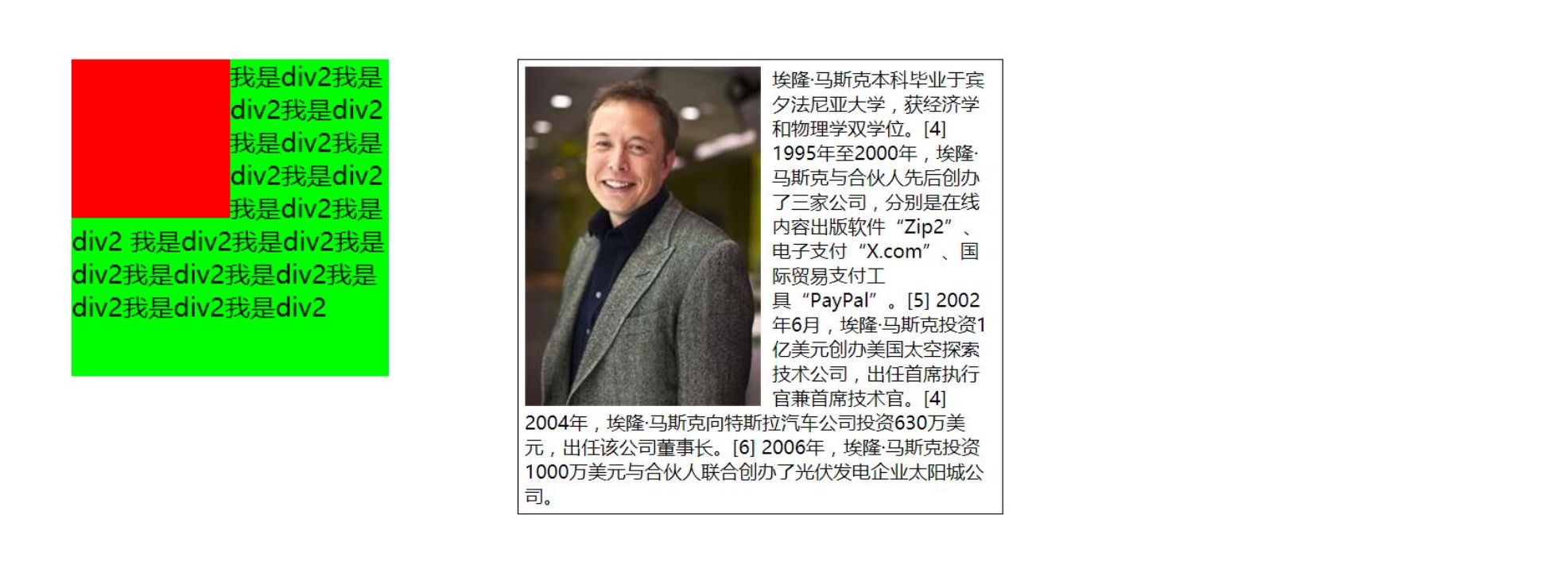
浮动规则四
- 浮动元素不能与行内级内容层叠,行内级内容将会被浮动元素推出
- 比如
行内级元素、inline-block元素、块级元素的文字内容
- 比如
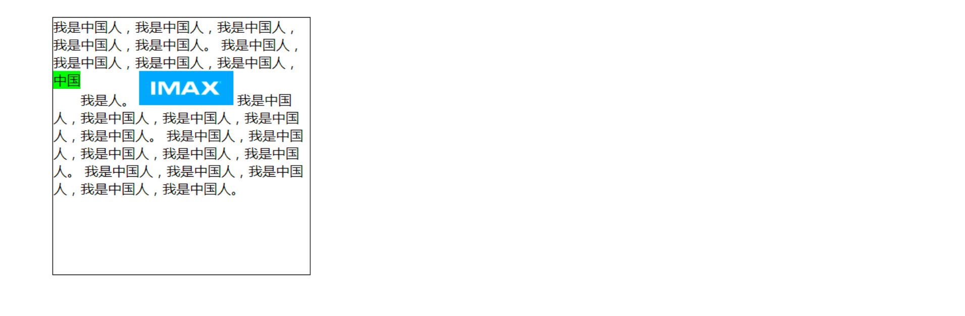
浮动规则五
- 规则五: 行内级元素、inline-block元素浮动后,其顶部将与所在行的顶部对齐
2.3. 练习一 - 去除间隙
- 浮动常用的场景
- 解决行内级元素、inline-block元素的
水平间隙问题
- 解决行内级元素、inline-block元素的
| <html lang="en"> | |
| <head> | |
| <meta charset="UTF-8"> | |
| <meta http-equiv="X-UA-Compatible" content="IE=edge"> | |
| <meta name="viewport" content="width=device-width, initial-scale=1.0"> | |
| <title>Document</title> | |
| <style> | |
| .box { | |
| /* font-size: 0; */ | |
| /* display: flex; */ | |
| } | |
| span { | |
| background-color: orange; | |
| /* font-size: 16px; */ | |
| /* float: left; | |
| margin-right: 5px; */ | |
| } | |
| </style> | |
| </head> | |
| <body> | |
| <!-- | |
| 将多个行内级元素中间的空格(间隙)去除的方法 | |
| 1. 删除换行符(不推荐) | |
| 2. 将父级元素的font-size设置为0, 但是需要子元素设置回来 | |
| 3. 通过子元素(span)统一向一个方向浮动即可 | |
| 4. flex布局(还没有学习) | |
| --> | |
| <div class="box"> | |
| <span>aaa</span> | |
| <span>bbb</span> | |
| <span>ccc</span> | |
| </div> | |
| </body> | |
| </html> |
2.4. 练习二 - 百度页码

| <html lang="en"> | |
| <head> | |
| <meta charset="UTF-8"> | |
| <meta http-equiv="X-UA-Compatible" content="IE=edge"> | |
| <meta name="viewport" content="width=device-width, initial-scale=1.0"> | |
| <title>Document</title> | |
| <style> | |
| /* 样式的重置 */ | |
| ul, li { | |
| list-style: none; | |
| padding: 0; | |
| margin: 0; | |
| } | |
| a { | |
| text-decoration: none; | |
| color: #333; | |
| } | |
| /* 全局设置 */ | |
| body { | |
| background-color: #f2f2f2; | |
| } | |
| /* 内容样式 */ | |
| ul > li { | |
| float: left; | |
| margin-left: 12px; | |
| } | |
| ul > li > a { | |
| display: inline-block; | |
| width: 36px; | |
| height: 36px; | |
| text-align: center; | |
| line-height: 36px; | |
| border-radius: 6px; | |
| background-color: #fff; | |
| color: #3951b3; | |
| font-size: 14px; | |
| } | |
| ul > li > a:hover, ul > li.active > a { | |
| background-color: blue; | |
| color: #fff; | |
| } | |
| ul > li.next > a { | |
| width: 80px; | |
| } | |
| </style> | |
| </head> | |
| <body> | |
| <!-- 结构: HTML --> | |
| <ul> | |
| <li class="item"><a href="#">1</a></li> | |
| <li class="item"><a href="#">2</a></li> | |
| <li class="item"><a href="#">3</a></li> | |
| <li class="item"><a href="#">4</a></li> | |
| <li class="item active"><a href="#">5</a></li> | |
| <li class="item"><a href="#">6</a></li> | |
| <li class="item"><a href="#">7</a></li> | |
| <li class="item"><a href="#">8</a></li> | |
| <li class="item"><a href="#">9</a></li> | |
| <li class="item"><a href="#">10</a></li> | |
| <li class="item next"><a href="#">下一页 ></a></li> | |
| </ul> | |
| </body> | |
| </html> |
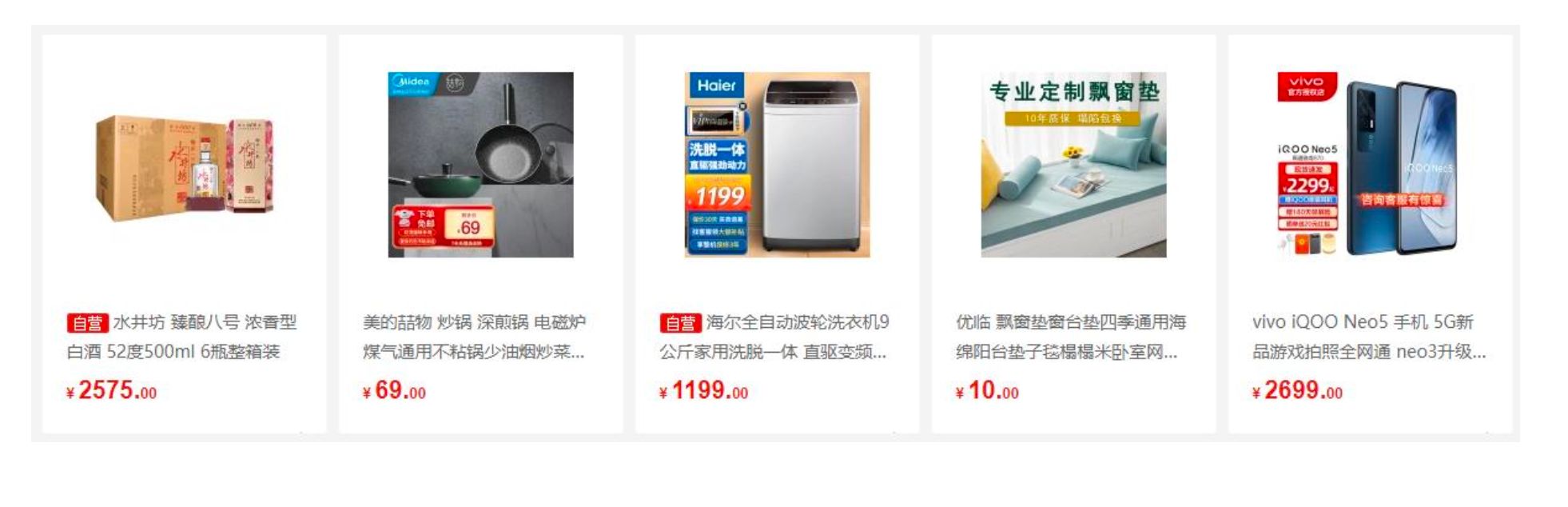
2.5. 练习三 - 京东多列布局
- 浮动布局方案:
- 实现京东页面下面的布局
- 这个注意听,讲到了
负margin
| <html lang="en"> | |
| <head> | |
| <meta charset="UTF-8"> | |
| <meta http-equiv="X-UA-Compatible" content="IE=edge"> | |
| <meta name="viewport" content="width=device-width, initial-scale=1.0"> | |
| <title>Document</title> | |
| <style> | |
| /* 公共的class */ | |
| .content { | |
| width: 1190px; | |
| margin: 0 auto; | |
| background-color: orange; | |
| height: 800px; | |
| } | |
| /* 布局样式 */ | |
| .box { | |
| /* margin: 0 -5px; */ | |
| /* 3.方案三: 设置负的的margin(没有兼容性) */ | |
| margin-right: -10px; | |
| } | |
| .item { | |
| width: 230px; | |
| height: 322px; | |
| background-color: purple; | |
| color: #fff; | |
| /* 浮动 */ | |
| float: left; | |
| margin-right: 10px; | |
| /* margin: 0 5px; */ | |
| } | |
| /* 1.有可能存在兼容性 */ | |
| /* .item:nth-child(5n) { | |
| margin-right: 0; | |
| } */ | |
| /* 2.麻烦一点点 */ | |
| /* .item.last-item { | |
| margin-right: 0; | |
| } */ | |
| </style> | |
| </head> | |
| <body> | |
| <div class="content"> | |
| <div class="box"> | |
| <div class="item item1">1</div> | |
| <div class="item item2">2</div> | |
| <div class="item item3">3</div> | |
| <div class="item item4">4</div> | |
| <div class="item item5">5</div> | |
| </div> | |
| </div> | |
| </body> | |
| </html> |
本博客所有文章除特别声明外,均采用 CC BY-NC-SA 4.0 许可协议。转载请注明来自 ZkeqのCoding日志!
相关推荐

评论