今日作业
| # Day05作业布置 | |
| ## 一. 写出案例,证明CSS属性的继承性 | |
| ## 二. 写出案例,证明CSS属性的层叠性 | |
| ## 三. 默写出display常见的值,并且说出对应的特性,并且写出测试案例 | |
| ## 四. 总结元素隐藏的方法,并且说出他们的区别 | |
| ## 五. 说说你对margin的传递和折叠的理解 | |
| ## 六. 块级元素在设置padding/border的上下时,有什么特殊的地方? | |
| ## 七. 进行下面的案例练习 | |
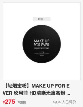
| * 可以先不做两行显示不全的... | |
| * 可以先不做评论的靠右内容 | |
| 中间的图片用这个:https://img12.360buyimg.com/n1/jfs/t1/159701/38/9948/81556/6040d1d9E6b486d68/5829df13f7b07b58.jpg |
day04 Day4参考答案(一)
一. 完成课堂所有代码(总结、整理)
CSS属性–文本
- 01-设置装饰性test-decoration
| <html lang="en"> | |
| <head> | |
| <meta charset="UTF-8" /> | |
| <meta http-equiv="X-UA-Compatible" content="IE=edge" /> | |
| <meta name="viewport" content="width=device-width, initial-scale=1.0" /> | |
| <title>Document</title> | |
| <style> | |
| .one { | |
| /* 设置装饰线--下划线 */ | |
| text-decoration: underline; | |
| } | |
| .two { | |
| /* 设置装饰线--上划线 */ | |
| text-decoration: overline; | |
| } | |
| .three { | |
| /* 设置装饰线--中划线(删除线) */ | |
| text-decoration: line-through; | |
| } | |
| a { | |
| /* 给a元素去除下划线 */ | |
| text-decoration: none; | |
| } | |
| </style> | |
| </head> | |
| <body> | |
| <a href="http://www.baidu.com">百度一下</a> | |
| <span class="one">模仿a</span> | |
| <span class="two">谷歌一下</span> | |
| <span class="three">必应一下</span> | |
| </body> | |
| </html> | |
- 02-text-transform
| <!DOCTYPE html> | |
| <html lang="en"> | |
| <head> | |
| <meta charset="UTF-8" /> | |
| <meta http-equiv="X-UA-Compatible" content="IE=edge" /> | |
| <meta name="viewport" content="width=device-width, initial-scale=1.0" /> | |
| <title>Document</title> | |
| <style> | |
| /* text-transform 设置文字的大小写转换 */ | |
| .one { | |
| /* 每个单词首字母大写 */ | |
| text-transform: capitalize; | |
| } | |
| .two { | |
| /* 全大写 */ | |
| text-transform: uppercase; | |
| } | |
| .three { | |
| /* 全小写 */ | |
| text-transform: lowercase; | |
| } | |
| .four { | |
| /* 默认,无影响 */ | |
| text-transform: none; | |
| } | |
| </style> | |
| </head> | |
| <body> | |
| <p class="one"> | |
| Life is full of confusing and disordering Particular time,a particular | |
| location, | |
| </p> | |
| <p class="two"> | |
| Do the arranged thing of ten million time in the brain,Step by step , | |
| </p> | |
| <p class="three"> | |
| the life is hard to avoid delicacy and stiffness No enthusiasm forever | |
| </p> | |
| <p class="four"> | |
| No unexpected happening of surprising and pleasing So,only silently ask | |
| myself in mind Next happiness,when will come? | |
| </p> | |
| </body> | |
| </html> | |
- 03-text-indent
| <html lang="en"> | |
| <head> | |
| <meta charset="UTF-8" /> | |
| <meta http-equiv="X-UA-Compatible" content="IE=edge" /> | |
| <meta name="viewport" content="width=device-width, initial-scale=1.0" /> | |
| <title>Document</title> | |
| <style> | |
| p { | |
| /* text-indent:设置第一行内容的缩进 */ | |
| /* text-indent: 20px; */ | |
| font-size: 20px; | |
| /* em 相对自身的字体大小 */ | |
| text-indent: 2em; | |
| } | |
| </style> | |
| </head> | |
| <body> | |
| <h2>航母</h2> | |
| <p> | |
| 从历史地位来说,003型航母是继001型航母“辽宁”号与001A型航母“山东”号之后,人民海军即将装备的第三艘航母,同时也是我国第一艘弹射起飞型航母。 | |
| 根据2021年美国战略与国际问题研究中心发布的高清卫星照片显示,003型航母比之前的“辽宁”号与“山东”号明显大了一圈,舰岛也改小了不少,因此具有更大的甲板面积,能够携带更多的作战飞机。 | |
| 由于003型航母采取了总装分段建造法,其建造工期相较于“辽宁”号与“山东”号大为缩短。 | |
| </p> | |
| </body> | |
| </html> | |
- 04-text-align的基本使用
| <!DOCTYPE html> | |
| <html lang="en"> | |
| <head> | |
| <meta charset="UTF-8" /> | |
| <meta http-equiv="X-UA-Compatible" content="IE=edge" /> | |
| <meta name="viewport" content="width=device-width, initial-scale=1.0" /> | |
| <title>Document</title> | |
| <style> | |
| .box { | |
| height: 100px; | |
| background-color: pink; | |
| color: #fff; | |
| /* text-align 设置文本(行内级元素,比如图片,文字)的对齐方式,相对于块级父元素, */ | |
| /* text-align: left; */ | |
| /* text-align: right; */ | |
| text-align: center; | |
| } | |
| </style> | |
| </head> | |
| <body> | |
| <div class="box">我是一段文字</div> | |
| </body> | |
| </html> | |
- 05-text-align-图片居中
| <html lang="en"> | |
| <head> | |
| <meta charset="UTF-8" /> | |
| <meta http-equiv="X-UA-Compatible" content="IE=edge" /> | |
| <meta name="viewport" content="width=device-width, initial-scale=1.0" /> | |
| <title>Document</title> | |
| <style> | |
| .box { | |
| background-color: pink; | |
| /* text-align: right; */ | |
| /* 让图片居中,text-align:center 让行内级元素(行内元素,行内块元素)居中. */ | |
| text-align: center; | |
| } | |
| </style> | |
| </head> | |
| <body> | |
| <div class="box"> | |
| <img src="../image/diqiu.jpg" alt="地球" /> | |
| </div> | |
| </body> | |
| </html> | |
- 06-text-align-块级元素
| <html lang="en"> | |
| <head> | |
| <meta charset="UTF-8" /> | |
| <meta http-equiv="X-UA-Compatible" content="IE=edge" /> | |
| <meta name="viewport" content="width=device-width, initial-scale=1.0" /> | |
| <title>Document</title> | |
| <style> | |
| .box { | |
| height: 200px; | |
| background-color: pink; | |
| /* 让块级元素居中对齐 */ | |
| /* text-align: center; */ | |
| } | |
| .content { | |
| /* 方法一:转换成行内块元素,然后父元素 text-align:center */ | |
| /* display: inline-block; */ | |
| width: 100px; | |
| height: 100px; | |
| background-color: green; | |
| /* 方法二:通过margin */ | |
| margin: 0 auto; | |
| } | |
| </style> | |
| </head> | |
| <body> | |
| <div class="box"> | |
| <div class="content">内容</div> | |
| </div> | |
| </body> | |
| </html> | |
- 07-text-align-justify
| <html lang="en"> | |
| <head> | |
| <meta charset="UTF-8" /> | |
| <meta http-equiv="X-UA-Compatible" content="IE=edge" /> | |
| <meta name="viewport" content="width=device-width, initial-scale=1.0" /> | |
| <title>Document</title> | |
| <style> | |
| .box { | |
| width: 300px; | |
| height: 300px; | |
| color: #fff; | |
| background-color: pink; | |
| /* 设置文字两端对齐 ,但是 对最后一行文字无效*/ | |
| text-align: justify; | |
| /* 要是想对最后一行有效 ,用 */ | |
| text-align-last: justify; | |
| } | |
| .one { | |
| width: 300px; | |
| height: 300px; | |
| color: #fff; | |
| background-color: green; | |
| /* 设置文字两端对齐 ,但是 对最后一行文字无效*/ | |
| text-align: justify; | |
| } | |
| </style> | |
| </head> | |
| <body> | |
| <div class="box"> | |
| Youth is not a time of life; it is a state of mind. It is not a matter of | |
| rosy cheeks, red lips and supple knees. It is a matter of the will, a | |
| quality of the imagination, vigor of the emotions; it is the freshness of | |
| the deep spring of life. vigor of the emotions;It is a matter | |
| </div> | |
| <div class="one"> | |
| Youth is not a time of life; it is a state of mind. It is not a matter of | |
| rosy cheeks, red lips and supple knees. It is a matter of the will, a | |
| quality of the imagination, vigor of the emotions; it is the freshness of | |
| the deep spring of life. vigor of the emotions;It is a matter | |
| </div> | |
| </body> | |
| </html> | |
- 08-letter-word-spacing
| <html lang="en"> | |
| <head> | |
| <meta charset="UTF-8" /> | |
| <meta http-equiv="X-UA-Compatible" content="IE=edge" /> | |
| <meta name="viewport" content="width=device-width, initial-scale=1.0" /> | |
| <title>Document</title> | |
| <style> | |
| .one { | |
| /* 设置字母之间的间距 */ | |
| letter-spacing: 10px; | |
| } | |
| .two { | |
| /* 设置单词之间的间距 */ | |
| word-spacing: 10px; | |
| } | |
| </style> | |
| </head> | |
| <body> | |
| <p class="one"> | |
| When the aerials are down, and your spirit is covered with the snows of | |
| cynicism and the ice of pessimism | |
| </p> | |
| <p class="two"> | |
| When the aerials are down, and your spirit is covered with the snows of | |
| cynicism and the ice of pessimism | |
| </p> | |
| <p> | |
| When the aerials are down, and your spirit is covered with the snows of | |
| cynicism and the ice of pessimism | |
| </p> | |
| </body> | |
| </html> | |
CSS属性-字体
- 01-font-size
| <html lang="en"> | |
| <head> | |
| <meta charset="UTF-8" /> | |
| <meta http-equiv="X-UA-Compatible" content="IE=edge" /> | |
| <meta name="viewport" content="width=device-width, initial-scale=1.0" /> | |
| <title>Document</title> | |
| <style> | |
| .box { | |
| font-size: 40px; | |
| } | |
| p { | |
| /* font-size: 20px; */ | |
| /* 字体大小 :px/em ,em 可以理解为相对于父元素的字体大小,也可以理解为子元素继承父元素的font-size,然后再针对于自己的font-size */ | |
| /* font-size: 2em; */ | |
| font-size: 200%; | |
| color: pink; | |
| } | |
| .one { | |
| /* 字体设置三:用百分比% .相对于父元素的font-size*/ | |
| /* font-size: 2em; */ | |
| font-size: 200%; | |
| } | |
| </style> | |
| </head> | |
| <body> | |
| <div class="box"> | |
| <p>白云是否也听过你的诉说</p> | |
| </div> | |
| <div class="one">摇摇晃晃忽明忽暗</div> | |
| <p>哈哈哈哈</p> | |
| </body> | |
| </html> | |
- 02-font-family
| <html lang="en"> | |
| <head> | |
| <meta charset="UTF-8" /> | |
| <meta http-equiv="X-UA-Compatible" content="IE=edge" /> | |
| <meta name="viewport" content="width=device-width, initial-scale=1.0" /> | |
| <title>Document</title> | |
| <style> | |
| p { | |
| /* font-family可以同时指定多个字体,用逗号隔开,如果浏览器不支持(操作系统的字体库) ,那就下一个,直到找到合适的字体,如果都没有,那以系统默认字体*/ | |
| font-size: 20px; | |
| font-family: Arial, "Microsoft Yahei", "微软雅黑"; | |
| } | |
| </style> | |
| </head> | |
| <body> | |
| <p>font-family 设置字体名称,可以有一个或多个</p> | |
| </body> | |
| </html> | |
- 03-font-weight
| <html lang="en"> | |
| <head> | |
| <meta charset="UTF-8" /> | |
| <meta http-equiv="X-UA-Compatible" content="IE=edge" /> | |
| <meta name="viewport" content="width=device-width, initial-scale=1.0" /> | |
| <title>Document</title> | |
| <style> | |
| p { | |
| font-size: 30px; | |
| font-weight: 700; | |
| } | |
| div { | |
| font-size: 30px; | |
| font-weight: bold; | |
| } | |
| </style> | |
| </head> | |
| <body> | |
| <p>font-weight设置字体粗细</p> | |
| <div>我是毛不易</div> | |
| </body> | |
| </html> | |
- 04-font-style
| <html lang="en"> | |
| <head> | |
| <meta charset="UTF-8" /> | |
| <meta http-equiv="X-UA-Compatible" content="IE=edge" /> | |
| <meta name="viewport" content="width=device-width, initial-scale=1.0" /> | |
| <title>Document</title> | |
| <style> | |
| div { | |
| font-size: 20px; | |
| /* normal常规显示 */ | |
| font-style: normal; | |
| } | |
| .one { | |
| /* 斜体,有专门的斜的字体 */ | |
| font-style: italic; | |
| } | |
| .two { | |
| /* 仅仅让文字倾斜 */ | |
| font-style: oblique; | |
| } | |
| </style> | |
| </head> | |
| <body> | |
| <div>font-style 设置字体风格(常规/斜体)</div> | |
| <p class="one">font-style 设置字体风格(常规/斜体)</p> | |
| <p class="two">font-style 设置字体风格(常规/斜体)</p> | |
| </body> | |
| </html> | |
- 05-font-variant
| <html lang="en"> | |
| <head> | |
| <meta charset="UTF-8" /> | |
| <meta http-equiv="X-UA-Compatible" content="IE=edge" /> | |
| <meta name="viewport" content="width=device-width, initial-scale=1.0" /> | |
| <title>Document</title> | |
| <style> | |
| p { | |
| font-size: 20px; | |
| /* font-variant: normal; */ | |
| /* 将小写字母替换成缩小版的大写字母 */ | |
| font-variant: small-caps; | |
| } | |
| </style> | |
| </head> | |
| <body> | |
| <p> | |
| Whether 60 or 16, there is in every human being’s heart the lure of | |
| wonders | |
| </p> | |
| </body> | |
| </html> | |
- 06-行高的基本理解
| <html lang="en"> | |
| <head> | |
| <meta charset="UTF-8" /> | |
| <meta http-equiv="X-UA-Compatible" content="IE=edge" /> | |
| <meta name="viewport" content="width=device-width, initial-scale=1.0" /> | |
| <title>Document</title> | |
| <style> | |
| /* * { | |
| padding: 0; | |
| margin: 0; | |
| } */ | |
| div { | |
| width: 300px; | |
| height: 300px; | |
| background-color: pink; | |
| font-size: 20px; | |
| /* 行高是一行文字所占据的高度,是两行文字基线到基线之间的距离, 值可以是数字,表示数字乘以该元素font-size的大小*/ | |
| /* line-height: 2; */ | |
| } | |
| p { | |
| line-height: 2; | |
| } | |
| </style> | |
| </head> | |
| <body> | |
| <div> | |
| 3月28日,为贯彻落实《中共中央 | |
| 国务院关于优化生育政策促进人口长期均衡发展的决定》,依据《中华人民共和国个人所得税法》有关规定,国务院发布通知决定,设立3岁以下婴幼儿照护个人所得税专项附加扣除。 | |
| </div> | |
| <div class="two"> | |
| <p> | |
| 我是多行文字,我是多行文字,我是多行文字,我是多行文字,我是多行文字,我是多行文字,我是多行文字,我是多行文字,我是多行文字,我是多行文字,我是多行文字, | |
| </p> | |
| </div> | |
| </body> | |
| </html> | |
- 07-line-height垂直居中
| <html lang="en"> | |
| <head> | |
| <meta charset="UTF-8" /> | |
| <meta http-equiv="X-UA-Compatible" content="IE=edge" /> | |
| <meta name="viewport" content="width=device-width, initial-scale=1.0" /> | |
| <title>Document</title> | |
| <style> | |
| div { | |
| width: 200px; | |
| height: 200px; | |
| /* 让一行文字垂直居中,line-height=height */ | |
| line-height: 200px; | |
| /* 行高>高度,字体向下,行高<高度,字体向上 */ | |
| line-height: 300px; | |
| line-height: 100px; | |
| background-color: pink; | |
| } | |
| </style> | |
| </head> | |
| <body> | |
| <div>我是div内部的一行文字</div> | |
| </body> | |
| </html> | |
- 08-font
| <html lang="en"> | |
| <head> | |
| <meta charset="UTF-8" /> | |
| <meta http-equiv="X-UA-Compatible" content="IE=edge" /> | |
| <meta name="viewport" content="width=device-width, initial-scale=1.0" /> | |
| <title>Document</title> | |
| <style> | |
| div { | |
| height: 40px; | |
| /* font-size: 20px; | |
| font-weight: 700; | |
| font-family: "微软雅黑"; | |
| font-style: italic; | |
| font-variant: small-caps; | |
| line-height: 1.5; */ | |
| background-color: pink; | |
| /* font:字体缩写 , font-style font-variant font-weight font-size/line-height font-family */ | |
| /* 前三个可以省略,顺序随便.line-height也可以省略,但必须在font-size后面,font-size和font-family不能省略 */ | |
| font: italic 700 small-caps 20px/2 "微软雅黑"; | |
| font: 20px "微软雅黑"; | |
| } | |
| </style> | |
| </head> | |
| <body> | |
| <div> | |
| font 属性可以用来作为 font-style, font-variant, font-weight, font-size, | |
| line-height 和 font-family 属性的简写 | |
| </div> | |
| </body> | |
| </html> | |
CSS选择器
- 01-通用选择器
| <html lang="en"> | |
| <head> | |
| <meta charset="UTF-8" /> | |
| <meta http-equiv="X-UA-Compatible" content="IE=edge" /> | |
| <meta name="viewport" content="width=device-width, initial-scale=1.0" /> | |
| <title>Document</title> | |
| <style> | |
| /* 通用选择器 */ | |
| * { | |
| padding: 0; | |
| margin: 0; | |
| } | |
| /* 更推荐 */ | |
| body, | |
| div, | |
| p { | |
| margin: 0; | |
| padding: 0; | |
| } | |
| </style> | |
| </head> | |
| <body> | |
| <div> | |
| <p>我是p元素</p> | |
| </div> | |
| <span> 我是span </span> | |
| <p>第一个</p> | |
| <p>第二个</p> | |
| </body> | |
| </html> | |
- 02-简单选择器
| <html lang="en"> | |
| <head> | |
| <meta charset="UTF-8" /> | |
| <meta http-equiv="X-UA-Compatible" content="IE=edge" /> | |
| <meta name="viewport" content="width=device-width, initial-scale=1.0" /> | |
| <title>Document</title> | |
| <style> | |
| .box { | |
| width: 300px; | |
| height: 300px; | |
| background-color: pink; | |
| } | |
| #one { | |
| color: blue; | |
| } | |
| span { | |
| color: #f00; | |
| } | |
| </style> | |
| </head> | |
| <body> | |
| <div class="box">hhhh</div> | |
| <p id="one">我是段落</p> | |
| <span>简单选择器分为元素选择器,类选择器,id选择器</span> | |
| <!-- id名,类名 如果有多个单词,可以用-,_和驼峰(大驼峰 小驼峰) --> | |
| <div class="box-two box_three">试一试</div> | |
| <div class="boxTwo BoxTwo">小驼峰 大驼峰</div> | |
| </body> | |
| </html> | |
- 03-属性选择器
| <html lang="en"> | |
| <head> | |
| <meta charset="UTF-8" /> | |
| <meta http-equiv="X-UA-Compatible" content="IE=edge" /> | |
| <meta name="viewport" content="width=device-width, initial-scale=1.0" /> | |
| <title>Document</title> | |
| <style> | |
| /* 属性选择器 */ | |
| /* 拥有某个属性 */ | |
| [title] { | |
| font-size: 30px; | |
| } | |
| [title="one"] { | |
| color: red; | |
| } | |
| /* 属性以什么开头 */ | |
| [title^="tw"] { | |
| color: green; | |
| } | |
| /* 属性包含 */ | |
| [title*="on"] { | |
| /* font-weight: 700; */ | |
| color: blue; | |
| } | |
| </style> | |
| </head> | |
| <body> | |
| <div title="one">给我你最最珍贵 所有的所有</div> | |
| <a href="#">百度一下</a> | |
| <p title="two">给你我义无反顾的长长和久久</p> | |
| <p title="twonnn">给你我义无反顾的长长和久久eeee</p> | |
| </body> | |
| </html> | |
- 04-后代选择器
| <html lang="en"> | |
| <head> | |
| <meta charset="UTF-8" /> | |
| <meta http-equiv="X-UA-Compatible" content="IE=edge" /> | |
| <meta name="viewport" content="width=device-width, initial-scale=1.0" /> | |
| <title>Document</title> | |
| <style> | |
| /* 后代选择器分为所有后代(直接和间接的后代 ,用空格) 和直接子代选择器,用> */ | |
| .box span { | |
| font-size: 30px; | |
| } | |
| .box > span { | |
| color: red; | |
| } | |
| </style> | |
| </head> | |
| <body> | |
| <div class="box"> | |
| <span>等待等待再等待</span> | |
| <div><span>当听见吉他的悲伤</span></div> | |
| </div> | |
| </body> | |
| </html> | |
- 05-兄弟选择器
| <html lang="en"> | |
| <head> | |
| <meta charset="UTF-8" /> | |
| <meta http-equiv="X-UA-Compatible" content="IE=edge" /> | |
| <meta name="viewport" content="width=device-width, initial-scale=1.0" /> | |
| <title>Document</title> | |
| <style> | |
| /* 兄弟选择器分为相邻选择器(+)和普遍兄弟选择器(~) */ | |
| .two + li { | |
| /* 向下一个 */ | |
| color: red; | |
| } | |
| /* 向下的所有 */ | |
| .two ~ li { | |
| font-size: 30px; | |
| } | |
| </style> | |
| </head> | |
| <body> | |
| <ul> | |
| <li>1</li> | |
| <li class="two">2</li> | |
| <li>3</li> | |
| <li>4</li> | |
| </ul> | |
| </body> | |
| </html> | |
- 06-选择器组-交集选择器
| <html lang="en"> | |
| <head> | |
| <meta charset="UTF-8" /> | |
| <meta http-equiv="X-UA-Compatible" content="IE=edge" /> | |
| <meta name="viewport" content="width=device-width, initial-scale=1.0" /> | |
| <title>Document</title> | |
| <style> | |
| /* 交集选择器 */ | |
| li.one { | |
| color: red; | |
| } | |
| li#two { | |
| background-color: pink; | |
| } | |
| </style> | |
| </head> | |
| <body> | |
| <ul> | |
| <li>床前明月光</li> | |
| <li class="one">疑是地上霜</li> | |
| <li>举头望明月</li> | |
| <li id="two">低头思故乡</li> | |
| </ul> | |
| </body> | |
| </html> | |
- 07-选择器组-并集选择器
| <html lang="en"> | |
| <head> | |
| <meta charset="UTF-8" /> | |
| <meta http-equiv="X-UA-Compatible" content="IE=edge" /> | |
| <meta name="viewport" content="width=device-width, initial-scale=1.0" /> | |
| <title>Document</title> | |
| <style> | |
| /* 并集选择器 ,*/ | |
| .one, | |
| #two { | |
| font-weight: 700; | |
| background-color: pink; | |
| } | |
| </style> | |
| </head> | |
| <body> | |
| <ul> | |
| <li>床前明月光</li> | |
| <li class="one">疑是地上霜</li> | |
| <li>举头望明月</li> | |
| <li id="two">低头思故乡</li> | |
| </ul> | |
| </body> | |
| </html> | |
- 08-动态伪类
| <html lang="en"> | |
| <head> | |
| <meta charset="UTF-8" /> | |
| <meta http-equiv="X-UA-Compatible" content="IE=edge" /> | |
| <meta name="viewport" content="width=device-width, initial-scale=1.0" /> | |
| <title>Document</title> | |
| <style> | |
| /* 未访问的状态 */ | |
| a:link { | |
| color: red; | |
| } | |
| /* 已访问过的状态 */ | |
| a:visited { | |
| color: green; | |
| } | |
| /* 聚焦的状态,按tab */ | |
| a:focus { | |
| color: purple; | |
| } | |
| /* 鼠标放在元素上的状态*/ | |
| a:hover { | |
| color: blue; | |
| } | |
| /* 激活,鼠标长按未松开 */ | |
| a:active { | |
| color: pink; | |
| } | |
| /* 按照顺序lvha,或者lvfha */ | |
| input:focus { | |
| color: blue; | |
| } | |
| /* 所有状态下同样的样式 直接给a元素设置样式,相当于给a元素的所有动态伪类都设置了*/ | |
| a { | |
| color: aqua; | |
| } | |
| </style> | |
| </head> | |
| <body> | |
| <a href="http://github.com">小米</a> | |
| <a href="http://www.baidu.com">小米</a> | |
| <input type="text" value="dddd" /> | |
| </body> | |
| </html> | |
二. 具体说明text-align居中的条件
text-align居中针对是行内级元素(inline-level),比如图片img,文字等.
对于块级元素,想要实现居中,可以通过display:inline-block将块级元素转换成行内块元素
三. line-height为什么可以让文字居中?
line-height表示一行文字的高度,也是两行文字基线之间的间距.
当line-height=height,就可以使这行文字在div内部垂直居中.
这是因为行高-文本高度(font-size)=行距,而行距平均分成上下两块,就使文本垂直居中了.
四. 总结目前所学过的所有选择器?思考它们的应用场景。
- 通用选择器 *{}
- 简单选择器
- 类选择器 .box {}
- id选择器 #box {}
- 元素选择器 div {}
- 后代选择器
- 所有的后代(直接或者间接的后代),用空格分割 .box span {}
- 直接子代选择器,用>分割 .box>span {}
- 属性选择器
- 拥有某一个属性 [attr] {}
- 属性等于某一个值 [att=val] {}
- 属性包含某一个值 [attr^=val]{}
- 兄弟选择器
- 相邻兄弟选择器,用+连接 .one+div {}
- 普遍兄弟选择器,用
连接 .onediv {}
- 选择器组
- 交集选择器 , 需要同时符合两个选择器条件(两个选择器紧密连接).在开发中通常为了精准的选择某一个元素
- 并集选择器: 符合一个选择器条件即可(两个选择器以,号分割. 在开发中通常为了给多个元素设置相同的样式
- 伪类选择器
- 动态伪类 ,有:link ,:visited,:hover,:active,:focus
- 目标伪类 ,有:target
- 语言伪类,有:lang()
- 元素状态伪类 :enabled,:disabled,:checked
- 结构伪类,
- :nth-child(n),:nth-last-child(n) ,:nth-of-type(n),:nth-last-of-type(n)
- :first-child,:last-child,:first-of-type,:last-of-type
- :root,:only-child,:only-of-type ,:empty
- 否定伪类,有:not
五. 预习结构伪类的使用方法。
E:nth-child(n) 匹配父元素中的第n个子元素E
E:nth-last-child(n) 匹配父元素下倒数第n个子元素
E:nth-of-type(n) 匹配父元素下指定类型的第n个子元素
E:nth-last-of-type(n) 匹配父元素下指定类型的倒数第n个子元素
E:first-child 匹配父元素中的第一个子元素E
E:last-child 匹配父元素中的最后一个子元素E
E:first-of-type 匹配父元素下指定类型的第一个子元素
E:last-of-type 匹配父元素下指定类型的最后一个子元素
:root 匹配文档树的根元素
:only-child 匹配没有任何兄弟元素的元素
:only-of-type 代表了任意一个元素,这个元素没有其他相同类型的兄弟元素。
:empty 代表没有子元素的元素。子元素只可以是元素节点或文本(包括空格)
六. 使用所学的HTML、CSS知识查找一个案例练习
模仿腾讯课堂历史回放模块
| <html lang="en"> | |
| <head> | |
| <meta charset="UTF-8" /> | |
| <meta http-equiv="X-UA-Compatible" content="IE=edge" /> | |
| <meta name="viewport" content="width=device-width, initial-scale=1.0" /> | |
| <title>Document</title> | |
| <style> | |
| * { | |
| padding: 0; | |
| margin: 0; | |
| } | |
| body { | |
| background-color: #f4f4f4; | |
| } | |
| .box { | |
| box-sizing: border-box; | |
| width: 1200px; | |
| margin: 100px auto; | |
| padding: 20px; | |
| border: 1px solid #f0f0f0; | |
| background-color: #fff; | |
| } | |
| .box h2 { | |
| height: 40px; | |
| line-height: 40px; | |
| font-size: 18px; | |
| margin: 10px 0 10px 0; | |
| } | |
| .list { | |
| position: relative; | |
| font-size: 14px; | |
| } | |
| .list-item { | |
| box-sizing: border-box; | |
| padding: 25px 20px; | |
| border: 1px solid #f0f0f0; | |
| } | |
| .item-index { | |
| float: left; | |
| margin-right: 17px; | |
| width: 23px; | |
| text-align: right; | |
| font-size: 18px; | |
| font-weight: 700; | |
| color: #192630; | |
| } | |
| .item-title { | |
| width: 450px; | |
| height: 20px; | |
| font-size: 14px; | |
| color: #192630; | |
| } | |
| .item-subtitle { | |
| width: 450px; | |
| font-size: 12px; | |
| color: #82919e; | |
| } | |
| .overdue { | |
| margin-left: 10px; | |
| } | |
| .item-btn { | |
| position: absolute; | |
| top: 30px; | |
| right: 30px; | |
| width: 80px; | |
| height: 30px; | |
| line-height: 30px; | |
| text-align: center; | |
| border: 1px solid #23b8ff; | |
| color: #23b8ff; | |
| border-radius: 2px; | |
| cursor: pointer; | |
| } | |
| </style> | |
| </head> | |
| <body> | |
| <div class="box"> | |
| <h2>历史回放</h2> | |
| <div class="list"> | |
| <div class="list-item"> | |
| <div class="item-index">4</div> | |
| <div class="item-title">CSS文字-字体-选择器</div> | |
| <div class="item-subtitle"> | |
| <span class="time">2022-03-28 周一 14:25-18:06</span> | |
| <span class="overdue">58天后过期</span> | |
| </div> | |
| <div class="item-btn">查看回放</div> | |
| </div> | |
| </div> | |
| <div class="list"> | |
| <div class="list-item"> | |
| <div class="item-index">3</div> | |
| <div class="item-title">CSS文字-字体-选择器</div> | |
| <div class="item-subtitle"> | |
| <span class="time">2022-03-28 周一 14:25-18:06</span> | |
| <span class="overdue">58天后过期</span> | |
| </div> | |
| <div class="item-btn">查看回放</div> | |
| </div> | |
| </div> | |
| <div class="list"> | |
| <div class="list-item"> | |
| <div class="item-index">2</div> | |
| <div class="item-title">CSS文字-字体-选择器</div> | |
| <div class="item-subtitle"> | |
| <span class="time">2022-03-28 周一 14:25-18:06</span> | |
| <span class="overdue">58天后过期</span> | |
| </div> | |
| <div class="item-btn">查看回放</div> | |
| </div> | |
| </div> | |
| <div class="list"> | |
| <div class="list-item"> | |
| <div class="item-index">1</div> | |
| <div class="item-title">CSS文字-字体-选择器</div> | |
| <div class="item-subtitle"> | |
| <span class="time">2022-03-28 周一 14:25-18:06</span> | |
| <span class="overdue">58天后过期</span> | |
| </div> | |
| <div class="item-btn">查看回放</div> | |
| </div> | |
| </div> | |
| </div> | |
| </body> | |
| </html> | |
day04 Day4参考答案(二)
一. 完成课堂所有代码(总结、整理)
1.1. text-decoration
text-decoration用于设置文字的装饰线(decoration-装饰) (不是继承属性)text-decoration有如下常见取值:none:无任何装饰线(可以去除a元素默认的下划线)underline:下划线overline:上划线line-through:中划线(删除线)
text-decoration属性是一种简写属性,并且可以使用普通属性三个值中的任何一个。普通属性如下:text-decoration-line:文本修饰的位置, 如下划线underline,删除线line-throughtext-decoration-color:文本修饰的颜色text-decoration-style:文本修饰的样式, 如波浪线wavy、实线solid、虚线dashedtext-decoration-thickness:文本修饰线的粗细(px)
- a元素有下划线的本质是被添加了
text-decoration:underline属性 - 一般会建一个reset.css文件 重置浏览器默认添加的样式
| /* 消除 a 元素默认的下划线 */ | |
| a { | |
| text-decoration: none; | |
| } |
- 例子:
| /* 红色 波浪 下划线 2px */ | |
| text-decoration:wavy underline red 2px |
1.2. text-transform(了解)
text-transform用于设置文字的大小写转换 (是继承属性)text-transform有几个常见的值:capitalize:(使…首字母大写, 资本化的意思)将每个单词的首字符变为大写uppercase:(大写字母)将每个单词的所有字符变为大写lowercase:(小写字母)将每个单词的所有字符变为小写none:没有任何影响
- 实际开发中用JavaScript代码转化的更多
1.3. text-indent
text-indent属性能定义一个块元素首行文本内容之前的缩进量 (是继承属性)- 属性值:
<length>:使用固定的值来指定文本的缩进。允许使用负值。 <percentage>:使用包含块宽度的百分比作为缩进each-line(实验中):文本缩进会影响第一行,以及使用<br>强制断行后的第一行
text-indent: 2em:刚好是缩进2个文字;- 例子:
| /* <length> 长度值 */ | |
| text-indent: 3mm; | |
| text-indent: 40px; | |
| /* <percentage>百分比值取决于其包含块(containing block)的宽度*/ | |
| text-indent: 15%; | |
| /* 关键字 */ | |
| text-indent: 5em each-line; | |
| text-indent: 5em hanging each-line; | |
1.4. text-align(重要)
text-align: 直接翻译过来设置文本的水平对齐方式 (是继承属性)(是继承属性)text-align并不控制块元素自己的对齐,只控制它的行内内容的对齐MDN解释: 定义行内内容(例如文字)如何相对它的块父元素对齐(可以设置图片居中)
W3C官方文档解释: 设置行内(inline-level)元素(没有填满父元素)在快级父元素的对齐方式
text-align常用的值:left:左对齐right:右对齐center:正中间显示justify:对最后一行无效(如果文字只有一行也无效)
直接设置对块级元素(例如
<div>)无效 可以更改<div>的display为inline-block- 例如:
| .box { | |
| /* 直接设置对快级元素无效*/ | |
| text-align: center; | |
| } | |
| div { | |
| /* 设置为行内元素 */ | |
| display: inline-block; | |
| } |
- 备注:居中一个块元素且不居中它的行内内容的标准兼容的方法是将它的左、右
margin设为auto, 例如:margin:auto; 或margin:0 auto; 或margin-left:auto; margin-right:auto;
1.5. letter-word-spacing
letter-spacing、word-spacing分别用于设置字母、单词之间的间距- 默认是0,可以设置为负数
| p { | |
| letter-spacing: 5px; | |
| word-spacing: 10px; | |
| } |
1.6. font-size
font-size决定文字的大小(是继承属性)- 属性值:
<length>:- 长度值 px(像素) 用像素字体定义使得字体大小不可由用户的浏览器改变
font-size: 30px - em:em = 希望得到的像素大小 / 父元素字体像素大小
font-size: 1.5em
- 长度值 px(像素) 用像素字体定义使得字体大小不可由用户的浏览器改变
<relative-size>,相对大小值- 比父元素的字体大或小,使用与上面的关键字的相近缩放比率
font-size: larger;font-size: smaller
<percentage>:百分比值 父元素字体大小的百分比:font-size: 80%
- 技巧:设置body元素的字体大小为62.5% (即默认大小16px的62.5%),等于10px。现在你可以通过计算基准大小10px的倍数,在任何元素上方便的使用em单位。这样有6px = 0.6em, 8px = 0.8em, 12px = 1.2em等
| body { | |
| font-size: 62.5%; | |
| } | |
| p { | |
| font: size 1.8em;(相当于18px) | |
| } |
1.7. font-family
font-family用于设置文字的字体名称 一般仅设置一次(是继承属性)- 可以设置1个或者多个字体名称
- 浏览器会选择列表中第一个该计算机上有安装的字体
- 或者是通过 @font-face 指定的可以直接下载的字体
- 常见的属性:
serif:带衬线字体,笔画结尾有特殊的装饰线或衬线sans-serif:无衬线字体,即笔画结尾是平滑的字体monospace:等宽字体,即字体中每个字宽度相同cursive:草书字体。这种字体有的有连笔,有的还有特殊的斜体效果fantasy:Fantasy 字体主要是那些具有特殊艺术效果的字体system-ui:从浏览器所处平台处获取的默认用户界面字体math:针对显示数学相关字符的特殊样式问题而设计的字体:支持上标和下标、跨行括号、嵌套表达式和具有不同含义的double struck glyphsemoji;专门用于呈现 Emoji 表情符号的字体fangsong:一种汉字字体,介于宋体和楷体之间。这种字体常用于某些政府文件
- 备注:一般建一个base.css文件确定整个网页的字体
| /* 直接设置body的样式 */ | |
| body { | |
| font-family: "Gill Sans", sans-serif; | |
| /* 京东设置的字体 */ | |
| /* font-family: "Microsoft YaHei", "Heiti SC", tahoma, arial, "Hiragino Sans GB", "\5B8B\4F53", sans-serif; */ | |
| } |
1.8. font-weight
font-weight用于设置文字的粗细(重量) (是继承属性)- 属性值:
normal:正常粗细。与400等值。bold:加粗。 与700等值lighter:比从父元素继承来的值更细(处在字体可行的粗细值范围内)(规则:父元素1-500 lighter=100 父元素600-700 lighter=400 父元素800-900 lighter=700)bolder;比从父元素继承来的值更粗 (处在字体可行的粗细值范围内)(规则:父元素1-300 bolder=400 父元素400-500 bolder=700 父元素600-900 bolder=900)<number>:一个介于1和1000(包含) 之间的<number>类型值
- 如果一个字体只有
normal和bold两种粗细值选择,指定粗细值为 100-500 时,实际渲染时将使用normal,指定粗细值为 600-900 时,实际渲染时将使用bold - 例子:
| /* 关键字值 */ | |
| font-weight: normal; | |
| font-weight: bold; | |
| /* 相对于父元素的关键字值 */ | |
| font-weight: lighter; | |
| font-weight: bolder; | |
| /* 具体的数值 */ | |
| font-weight: 1 | |
| font-weight: 100; | |
| font-weight: 100.6; | |
| font-weight: 123; | |
| font-weight: 321; | |
| font-weight: 400; | |
| font-weight: 700; | |
| font-weight: 1000; | |
1.9. font-style
font-style用于设置文字的常规、斜体显示 (是继承属性)- 属性值:
normal:常规显示italic(斜体):用字体的斜体显示(通常会有专门的字体)oblique(倾斜):文本倾斜显示(仅仅是让文字倾斜)
- 例子:
| /* oblique,可附加一个可选的角度 */ | |
| font-style: oblique 20deg; |
1.10. font-varient
font-variant可以影响小写字母的显示形式- 属性值:
normal:常规显示small-caps:将小写字母替换为缩小过的大写字母
- 例子:
font-variant: small-caps
1.11. line-height
line-height:两行文字基线(baseline)之间的间距 基线(baseline):与小写字母x最底部对齐的线- 行高 - 文本高度 = 行距
- 属性值:
normal:取决于用户端。桌面浏览器(包括Firefox)使用默认值,约为1.2,这取决于元素的font-family<数字>:该属性的应用值是这个无单位数字<数字>乘以该元素的字体大小这是设置line-height的推荐方法,不会在继承时产生不确定的结果<长度>:指定<长度>用于计算 line box 的高度 以 em 为单位的值可能会产生不确定的结果<百分比>:与元素自身的字体大小有关。计算值是给定的百分比值乘以元素计算出的字体大小。百分比值可能会带来不确定的结果
height:元素的整体高度line-height:元素中每一行文字所占据的高度- 假设div中只有一行文字,如何让这行文字在div内部垂直居中 让
line-height等同于height
1.12. font缩写属性
font属性可以用来作为font-style,font-variant,font-weight,font-size,line-height和font-family属性的简写,或将元素的字体设置为系统字体- 规则:
ont-style、font-variant、font-weight可以随意调换顺序,也可以省略line-height可以省略,如果不省略,必须跟在font-size后面font-size、font-family不可以调换顺序,不可以省略
- 例子:
| /* 文字属性 */ | |
| font-style: italic; | |
| font-variant: normal; | |
| font-weight: 700; | |
| font-size: 24px; | |
| line-height: 1.5; | |
| font-family: cursive; | |
| /* 缩写 等价于上面的设置*/ | |
| font: italic normal 700 24px/1.5 cursive; |
二. 具体说明text-align居中的条件
text-align: 直接翻译过来设置文本的水平对齐方式 (是继承属性)(是继承属性)text-align并不控制块元素自己的对齐,只控制它的行内内容的对齐MDN解释: 定义行内内容(例如文字)如何相对它的块父元素对齐(可以设置图片居中)
W3C官方文档解释: 设置行内(inline-level)元素(没有填满父元素)在快级父元素的对齐方式
三. line-height为什么可以让文字居中?
line-height:两行文字基线(baseline)之间的间距 基线(baseline):与小写字母x最底部对齐的线- 一行文本 等于 line-height
- 行高 - 文本高度 = 行距
- 属性值:
normal:取决于用户端。桌面浏览器(包括Firefox)使用默认值,约为1.2,这取决于元素的font-family<数字>:该属性的应用值是这个无单位数字<数字>乘以该元素的字体大小这是设置line-height的推荐方法,不会在继承时产生不确定的结果<长度>:指定<长度>用于计算 line box 的高度 以 em 为单位的值可能会产生不确定的结果<百分比>:与元素自身的字体大小有关。计算值是给定的百分比值乘以元素计算出的字体大小。百分比值可能会带来不确定的结果
height:元素的整体高度line-height:元素中每一行文字所占据的高度- 假设div中只有一行文字,如何让这行文字在div内部垂直居中 让
line-height等同于height
四. 总结目前所学过的所有选择器?思考它们的应用场景。
4.1. 统配选择器
通配选择器(universal selector):所有的元素都会被选中
- 用法:
*{} - 通配选择器是性能最低的一个CSS选择器 不推荐使用
- 例子:
- 用法:
| * { | |
| color: skyblue; | |
| font-size: 18px; | |
| } | |
4.2. 简单选择器(重要)
简单选择器
元素选择器(type selectors):会匹配该文档中所有此类型的元素
- 用法:
元素名称{样式声明} - 例子:
- 用法:
| span { | |
| color: skyblue; | |
| font-size: 16px; | |
| } |
类选择器(class selectors):类属性被定义为一个以空格分隔的列表项,在这组类名中,包含类选择器中的类名,样式声明才会生效
- 用法:
.类名 {样式声明} - 例子:
- 用法:
| .classname { | |
| color: red; | |
| font-size: 20px; | |
| } |
id选择器(id selectors):元素 id 属性名必须与选择器中的 id 属性名完全匹配,样式声明才会生效
- 用法:
#id属性值 {样式声明} - 备注:一个HTML文档里面的id值是唯一的,不能重复,id值如果由多个单词组成,单词之间可以用
中划线-、下划线_连接,也可以使用驼峰标识最好不要用标签名作为id值 - 例子
- 用法:
| #idname { | |
| color: purple; | |
| font-size: 24px; | |
| } |
4.3. 属性选择器
- 属性选择器(attribute selectors)
- 用法:
[attr]:表示带有以 attr 命名的属性的元素[attr=value]:表示带有以 attr 命名的属性,且属性值为 value 的元素[attr*=value]:表示带有以 attr 命名的属性,且属性值至少包含一个 value 值的元素[attr^=value];表示带有以 attr 命名的属性,且属性值是以 value 开头的元素[attr$=value]:表示带有以 attr 命名的属性,且属性值是以 value 结尾的元素[attr|=value]:表示带有以 attr 命名的属性的元素,属性值为“value”或是以“value-”为前缀[attr~=value];表示带有以 attr 命名的属性的元素,并且该属性是一个以空格作为分隔的值列表,其中至少有一个值为 value
- 例子:
| /* 存在title属性的<a> 元素 */ | |
| a[title] { | |
| color: purple; | |
| } | |
| /* 存在href属性并且属性值匹配"https://example.org"的<a> 元素 */ | |
| a[href="https://example.org"] { | |
| color: green; | |
| } | |
| /* 存在href属性并且属性值包含"example"的<a> 元素 */ | |
| a[href*="example"] { | |
| font-size: 2em; | |
| } | |
| /* 存在href属性并且属性值结尾是".org"的<a> 元素 */ | |
| a[href$=".org"] { | |
| font-style: italic; | |
| } | |
| /* 存在class属性并且属性值包含以空格分隔的"logo"的<a>元素 */ | |
| a[class~="logo"] { | |
| padding: 2px; | |
| } | |
| /* 以 "#" 开头的页面本地链接 */ | |
| a[href^="#"] { | |
| background-color: gold; | |
| } | |
| /* 包含 "example" 的链接 */ | |
| a[href*="example"] { | |
| background-color: silver; | |
| } | |
| /* 以 ".org" 结尾的链接 */ | |
| a[href$=".org"] { | |
| color: red; | |
| } | |
| /* 将所有包含 `lang` 属性的 <div> 元素的字重设为 bold */ | |
| div[lang] { | |
| font-weight: bold; | |
| } | |
| /* 将所有语言为美国英语的 <div> 元素的文本颜色设为蓝色 */ | |
| div[lang~="en-us"] { | |
| color: blue; | |
| } | |
4.4. 后代选择器(重要)
后代选择器(descendant combinator)
后代选择器一: 所有的后代(直接/间接的后代)
- 用法:选择器之间以
空格分割 - 例子:
- 用法:选择器之间以
| .box span{ | |
| color: skyblue; | |
| } |
后代选择器二: 直接子代选择器(必须是直接自带)
- 用法:选择器之间以
>分割 - 例子:
- 用法:选择器之间以
| .box > span{ | |
| font-size: 30px; | |
| } |
4.5. 兄弟选择器
兄弟选择器(sibling combinator)
通用兄弟选择器:使用符号
~连接 位置无须紧邻,只须同层级,A~B 选择A元素之后所有同层级B元素- 例子:
| .box~.item{ | |
| font-size: 30px; | |
| color: skyblue; | |
| } | |
| /* p元素后面的同级span都被选中 */ | |
| p ~ span { | |
| color: red; | |
| } |
相邻兄弟选择器:使用符号
+连接 第二个元素紧跟在第一个元素之后,并且两个元素都是属于同一个父元素的子元素,则第二个元素将被选中- 例子:
| .box+.content { | |
| color: red; | |
| } | |
| /* 图片后面紧跟着的段落将被选中 */ | |
| img + p { | |
| font-style: bold; | |
| } |
4.6. 选择器组(重要)
选择器组
交集选择器: 需要同时符合两个选择器条件(两个选择器紧密连接)
可以精准的选择某一个元素
- 例子:
| div.box { | |
| color: skyblue; | |
| } | |
| .box#second { | |
| font-size: 30px; | |
| } |
并集选择器:符合一个选择器条件即可(两个选择器以
,号分割)给多个元素设置相同的样式
- 例子:
| div.box, p, h2 { | |
| color: skyblue; | |
| } |
五. 预习结构伪类的使用方法。
伪类(pseudo-classes)选择器
动态伪类(dynamic pseudo-classes)
- 属性值:
:link、:visited、:hover、:active、:focus - 用法:
- 属性值:
| /* a:link 未访问的链接 */ | |
| a:link { | |
| color: skyblue; | |
| } | |
| /* a:visited 已访问的链接 */ | |
| a:visited { | |
| color: darkmagenta; | |
| font-size: 30px; | |
| } | |
| /* a:focus 获得焦点 tab键 */ | |
| a:focus { | |
| color: green; | |
| } | |
| /* a:hover 鼠标挪动到链接上 */ | |
| a:hover { | |
| color: blue; | |
| } | |
| /* a:active 激活的链接(鼠标在链接上长按住未松开) */ | |
| a:active { | |
| color: red; | |
| font-size: 24px; | |
| } |
六. 使用所学的HTML、CSS知识查找一个案例练习
务必下载!!
今日的代码和讲义 以及思维导图:【点击此链接下载 Day05.zip】
大纲
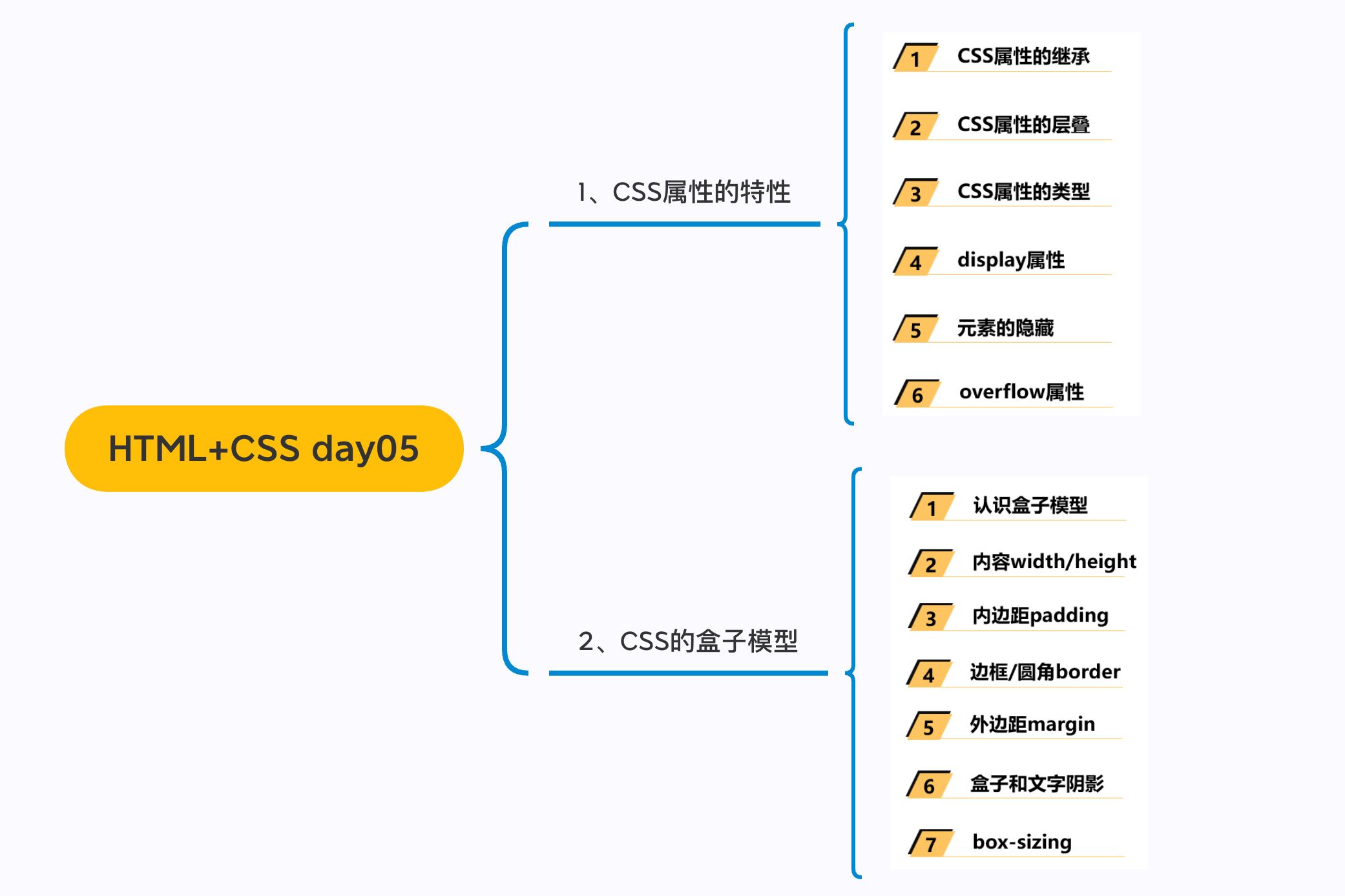
2.1. CSS属性继承
- CSS的某些属性具有继承性(
Inherited):- 如果一个
属性具备继承性, 那么在该元素上设置后, 它的后代元素都可以继承这个属性; - 当然, 如果
后代元素自己有设置该属性, 那么优先使用后代元素自己的属性(不管继承过来的属性权重多高);
- 如果一个
- 如何知道一个属性是否具有继承性呢?
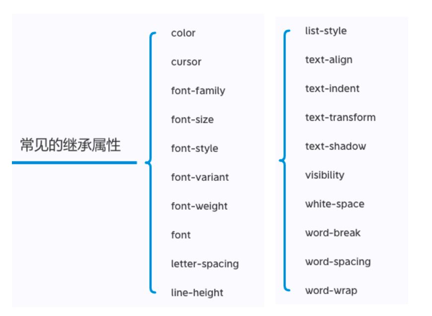
- 常见的
font-size/font-family/font-weight/line-height/color/text-align都具有继承性;- 一般和文本/字体相关的很多属性都具备继承;
- 这些不用刻意去记, 用的多自然就记住了;
xmind、多查文档
- 常见的
- 另外要多学会查阅文档,文档中每个属性都有标明其继承性的
| 可以强制继承 | |
| - `item : inherit` |
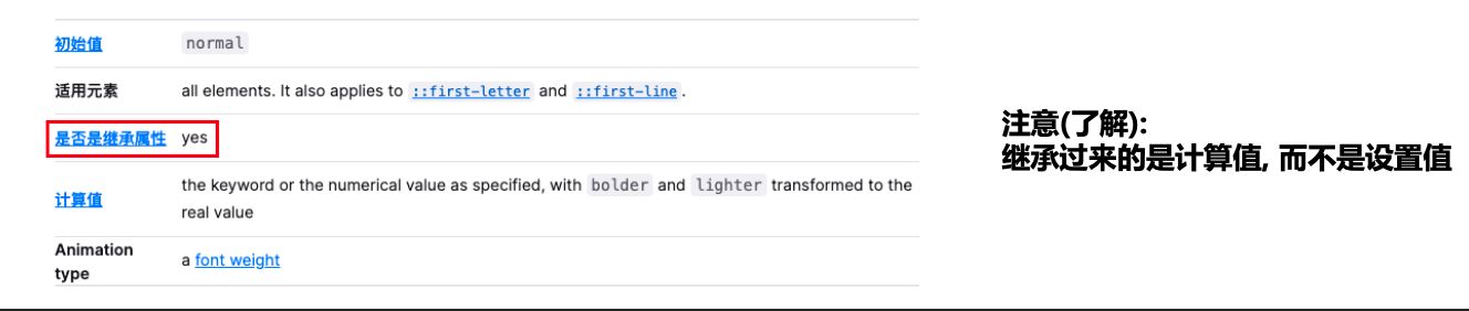
常见的继承属性有哪些呢?(不用记)
2.2. CSS属性层叠
| 一个CSS属性可以多次设置: | |
| * 判断一: 权重, 优先级; | |
| * 判断二: 先后顺序; | |
| 常见的选择器: | |
| * -> 10000 | |
| * 内联 -> 1000 | |
| * id -> 100 | |
| * 类/伪类/属性 -> 10 | |
| * 元素 -> 1 | |
| * 统配 -> 0 |
- CSS的翻译是层叠样式表,什么是
层叠呢?- 对于一个元素来说,
相同一个属性我们可以通过不同的选择器给它进行多次设置; - 那么属性会
被一层层覆盖上去; - 但是最终
只有一个会生效;
- 对于一个元素来说,
- 那么多个样式属性覆盖上去,哪一个会生效呢?
- 判断一:
选择器的权重,权重大的生效,根据权重可以判断出优先级; - 判断二:
先后顺序,权重相同时,后面设置的生效;
- 判断一:
- 那么如何知道元素的权重呢?
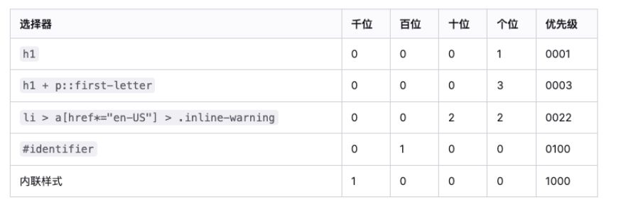
选择器的权重
- 按照经验,为了方便比较CSS属性的优先级,可以给CSS属性所处的环境定义一个权值(权重)
!important:10000内联样式:1000id选择器:100类选择器、属性选择器、伪类:10元素选择器、伪元素:1通配符:0
2.3. 元素的类型
| * div -> 块级元素 | |
| * span -> 行内级 | |
| * 有本质的区别 -> display: block | |
| * span -> 块级 | |
| * div -> 行内级 | |
| display: | |
| * block | |
| * 独占一行(父元素) | |
| * 可以设置宽度和高度 | |
| * 默认高度是内容的高度 | |
| * inline-block | |
| * 和其他行内级元素在同一行显示 | |
| * 可以设置宽度和高度 | |
| * 默认宽高由内容决定 | |
| * inline | |
| * 和其他行内级元素在同一行显示 | |
| * 不能设置宽度和高度 | |
| * 宽高由内容决定 |
在前面我们会经常提到div是
块级元素会独占一行**, **span 是行内级元素会在同一行显示.- 到底什么是块级元素, 什么是行内级元素呢?
HTML定义元素类型的思路:
HTML元素有很多, 比如h元素/p元素/div元素/span元素/img元素/a元素等等;- 当我们把这个元素
放到页面上时, 这个元素到底占据页面中一行多大的空间呢?- ✓ 为什么我们这里
只说一行呢? 因为垂直方向的高度通常是内容决定的;
- ✓ 为什么我们这里
- 比如一个
h1元素的标题, 我们必然是希望它独占一行的, 其他的内容不应该和我的标题放在一起; - 比如一个
p元素的段落, 必然也应该独占一行, 其他的内容不应该和我的段落放在一起; - 而类似于
img/span/a元素, 通常是对内容的某一个细节的特殊描述, 没有必要独占一行;
所以, 为了区分哪些元素需要独占一行, 哪些元素不需要独占一行, HTML将元素区分(本质是通过CSS的)成了两类:
块级元素(
block-level elements): 独占父元素的一行行内级元素(
inline-level elements):多个行内级元素可以在父元素的同一行中显示
通过CSS修改元素类型
- 前面我们说过,事实上元素没有本质的区别:
div是块级元素,span是行内级元素;div之所以是块级元素仅仅是因为浏览器默认设置了display属性而已;

- 那么我们是否可以通过
display来改变元素的特性呢?当然可以!
2.4. 元素的隐藏方法
| * display: none | |
| * visibility: hidden | |
| * rgba -> alpha | |
| * opacity -> 设置透明度 | |
| * 所有的子元素都会跟着一起设置 |
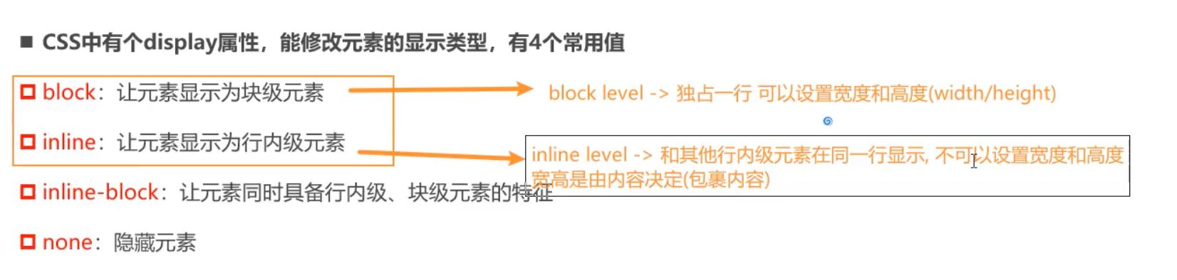
- CSS中有个
display属性,能修改元素的显示类型,有4个常用值block:让元素显示为块级元素inline:让元素显示为行内级元素inline-block:让元素同时具备行内级、块级元素的特征none:隐藏元素
- 事实上
display还有其他的值, 比如flex, 后续会专门学习;
display值的特性(非常重要)
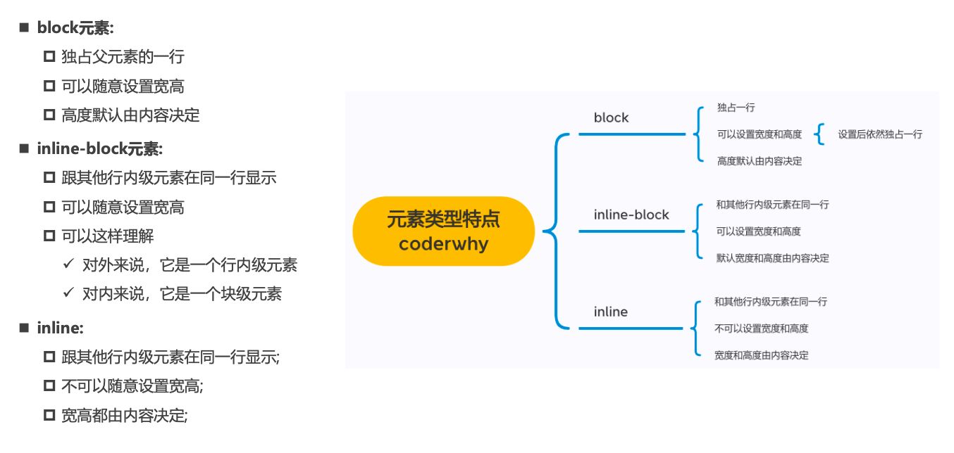
block元素:- 独占父元素的一行
- 可以随意设置宽高
- 高度默认由内容决定
inline-block元素:- 跟其他行内级元素在同一行显示
- 可以随意设置宽高
- 可以这样理解
- ✓ 对外来说,它是一个行内级元素
- ✓ 对内来说,它是一个块级元素
inline:- 跟其他行内级元素在同一行显示;
- 不可以随意设置宽高;
- 宽高都由内容决定;
行内替换元素(inline-replaced)(补充)
- 和其他的行内级元素在同一行显示
- 可以设置宽度和高度
img是行内替换元素不是行内块级元素
编写HTML时的注意事项
块级元素、inline-block元素- 一般情况下,
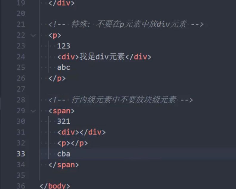
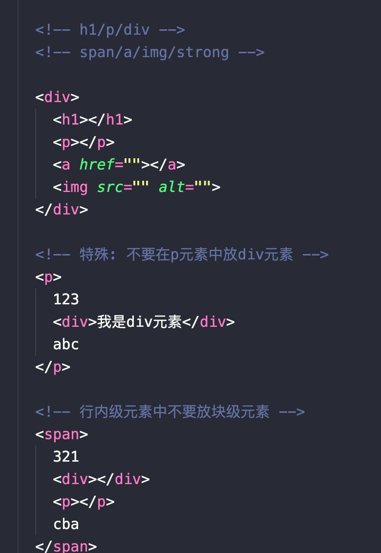
可以包含其他任何元素(比如块级元素、行内级元素、inline-block元素) - 特殊情况,
p元素不能包含其他块级元素
- 一般情况下,
- 行内级元素(比如
a、span、strong等)- 一般情况下,只能
包含行内级元素
- 一般情况下,只能
元素隐藏方法
- 方法一:
display设置为none- 元素不显示出来, 并且也不占据位置,
不占据任何空间(和不存在一样);
- 元素不显示出来, 并且也不占据位置,
- 方法二:
visibility设置为hidden- 设置为
hidden, 虽然元素不可见, 但是会占据元素应该占据的空间; - 默认为
visible, 元素是可见的;
- 设置为
- 方法三:
rgba设置颜色,将a的值设置为0- rgba的
a设置的是alpha值, 可以设置透明度, 不影响子元素;
- rgba的
- 方法四:
opacity设置透明度,设置为0- 设置整个元素的透明度, 会影响所有的子元素;
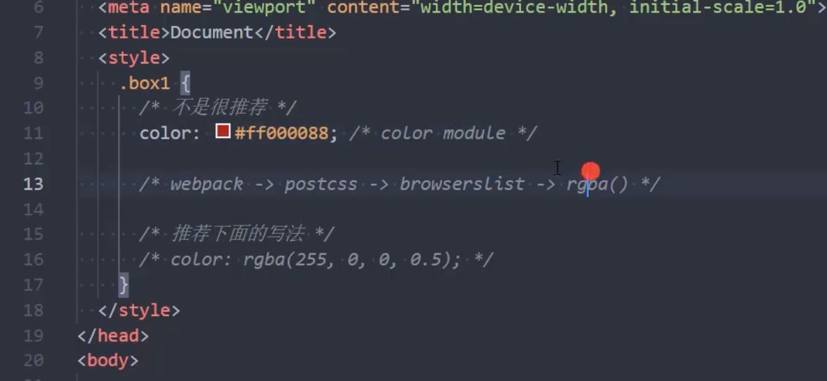
CSS样式不生效技巧
- 为何有时候编写的
CSS属性不好使,有可能是因为- 选择器的优先级太低
- 选择器没选中对应的元素
- CSS属性的使用形式不对
- ✓ 元素不支持此
CSS属性,比如span默认是不支持width和height的 - ✓ 浏览器不支持此
CSS属性,比如旧版本的浏览器不支持一些css module3的某些属性 - ✓ 被同类型的
CSS属性覆盖,比如font覆盖font-size
- ✓ 元素不支持此
- 建议
- 充分利用浏览器的开发者工具进行调试(增加、修改样式)、查错
2.5. overflow
| * visible | |
| * hidden | |
| * scroll | |
| * auto |
overflow: 用于控制内容溢出时的行为visible:溢出的内容照样可见hidden:溢出的内容直接裁剪scroll:溢出的内容被裁剪,但可以通过滚动机制查看- 会一直显示滚动条区域,滚动条区域占用的空间属于
width、height
- 会一直显示滚动条区域,滚动条区域占用的空间属于
auto:自动根据内容是否溢出来决定是否提供滚动机制
2.6. HTML嵌套的规范
| * 块级/行内块级可以嵌套其他元素 | |
| * p元素不能嵌套div元素 | |
| * 行内级元素不能嵌套块级元素 |
三. 盒子模型
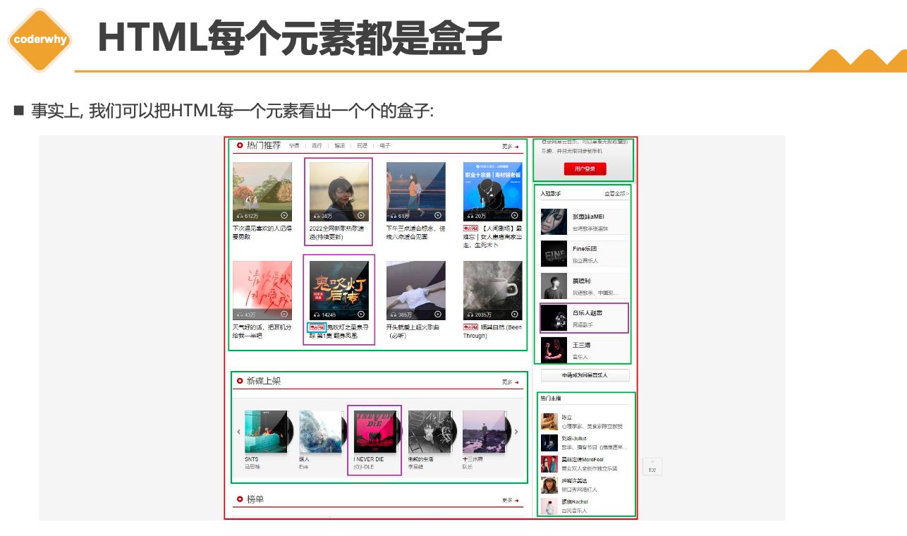
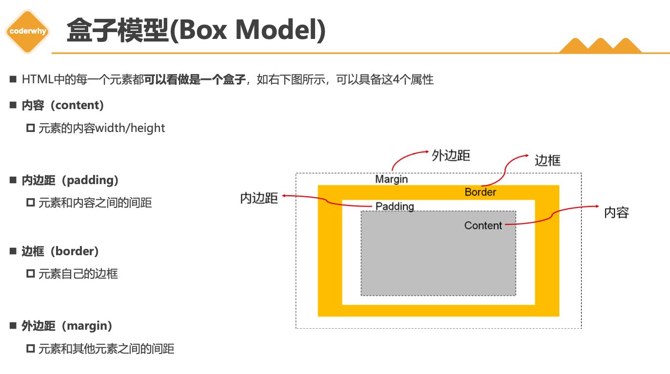
3.1. 认识盒子模型
| * 照片墙 | |
| * HTML元素都是盒子 | |
| * 盒子模型组成属性: | |
| * content | |
| * padding | |
| * border | |
| * margin |
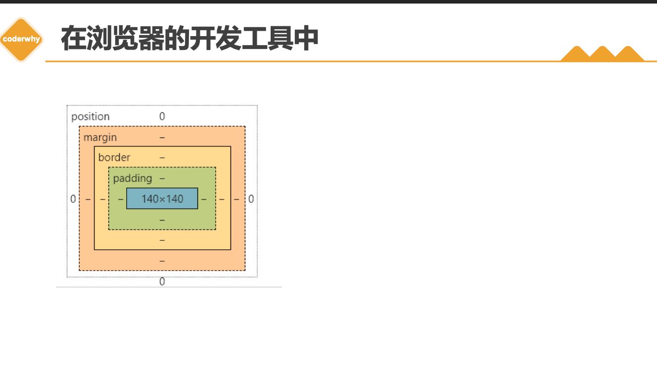
3.2. content
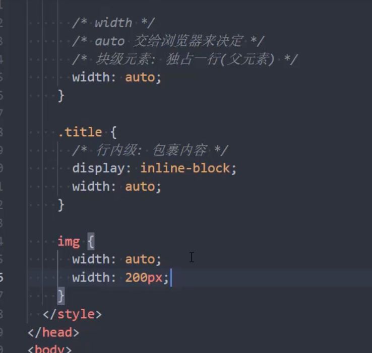
| * width/height | |
| * width: auto | |
| * min-width/max-width |
- 设置内容是通过宽度和高度设置的:
- 宽度设置:
width - 高度设置:
height
- 宽度设置:
- 注意: 对于行内级非替换元素来说, 设置宽高是无效的!
- 另外我们还可以设置如下属性:
min-width:最小宽度,无论内容多少,宽度都大于或等于min-widthmax-width:最大宽度,无论内容多少,宽度都小于或等于max-width- 移动端适配时, 可以设置最大宽度和最小宽度;
- 下面两个属性不常用:
min-height:最小高度,无论内容多少,高度都大于或等于min-heightmax-height:最大高度,无论内容多少,高度都小于或等于max-height
3.3. padding
| 内边距: | |
| * 四个方法 | |
| * padding | |
| * 4/3/2/1 |
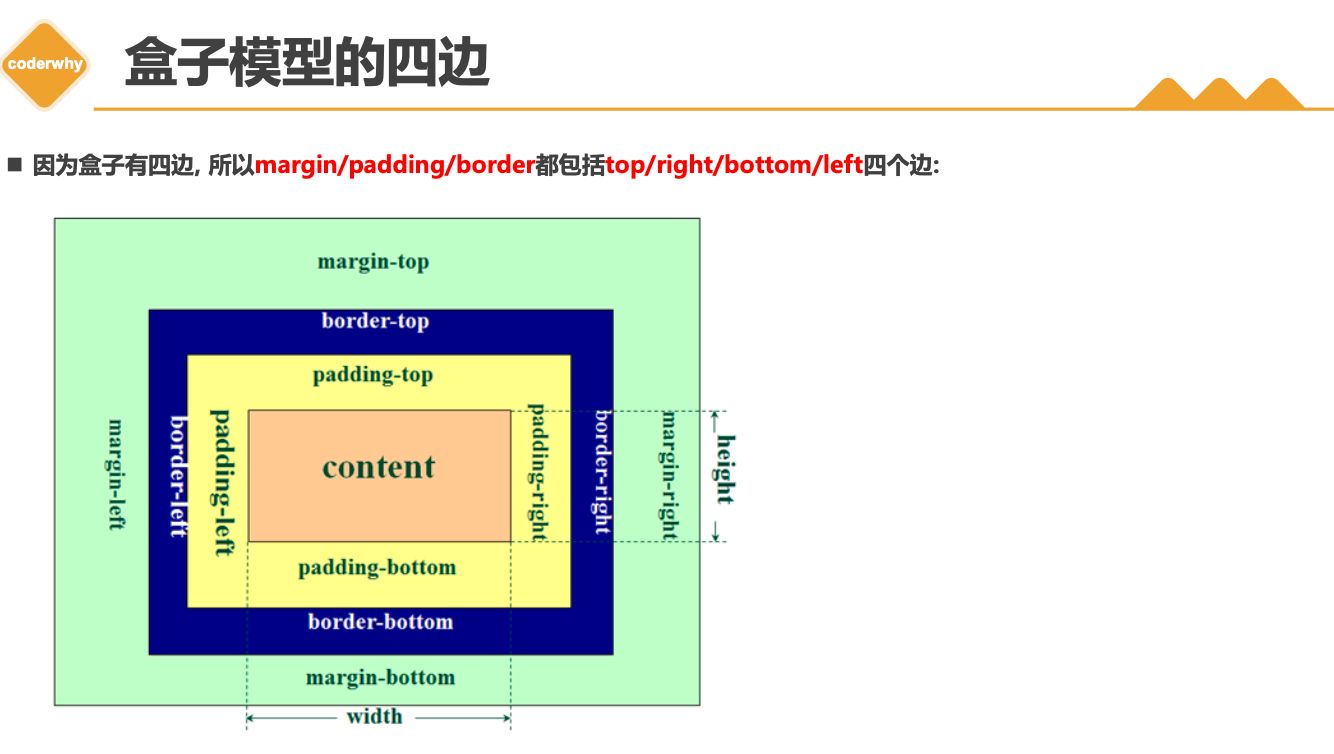
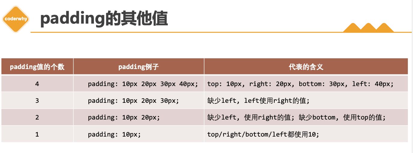
padding属性用于设置盒子的内边距 , 通常用于设置边框和内容之间的间距;padding包括四个方向,所以有如下的取值:padding-top:上内边距padding-right:右内边距padding-bottom:下内边距padding-left:左内边距
padding单独编写是一个缩写属性:padding-top、padding-right、padding-bottom、padding-left的简写属性padding缩写属性是从零点钟方向开始, 沿着顺时针转动的, 也就是上右下左;
padding并非必须是四个值,也可以有其他值;
3.4. border
| 边框 | |
| * width | |
| * style | |
| * color | |
| ```css | |
| div { | |
| border: 10px solid red; | |
| } | |
| ``` |
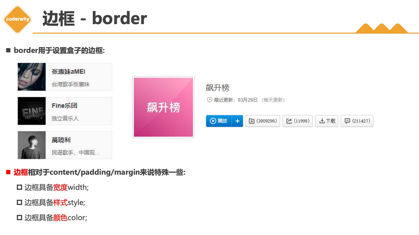
设置边框的方式
- 边框宽度
border-top-width、border-right-width、border-bottom-width、border-left-widthborder-width是上面4个属性的简写属性
- 边框颜色
border-top-color、border-right-color、border-bottom-color、border-left-colorborder-color是上面4个属性的简写属性
- 边框样式
border-top-style、border-right-style、border-bottom-style、border-left-styleborder-style是上面4个属性的简写属性
边框的样式设置值
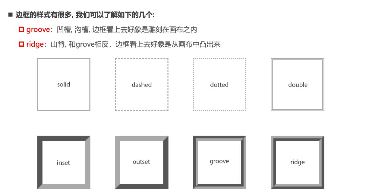
- 边框的样式有很多,我们可以了解如下的几个:
groove:凹槽, 沟槽, 边框看上去好象是雕刻在画布之内ridge:山脊, 和grove相反,边框看上去好象是从画布中凸出来
同时设置的方式
- 如果我们相对
某一边同时设置宽度样式颜色,可以进行如下设置: border-topborder-rightborder-bottomborder-leftborder: 统一设置 4 个方向的边框
3.5. border-radius
| 圆角: | |
| * 具体的值, 比如6px | |
| * 百分比 -> border box(了解) | |
| * 50% |
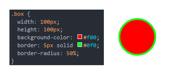
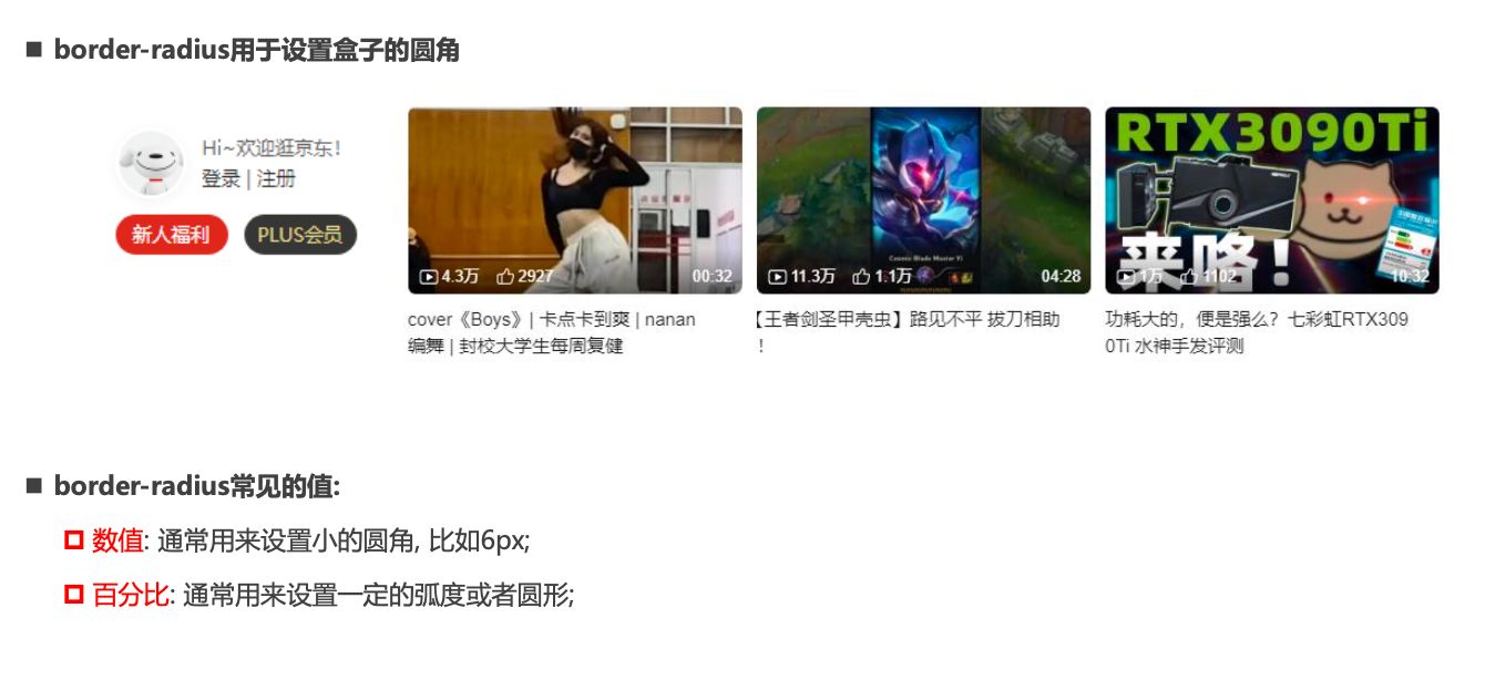
border-radius用于设置盒子的圆角border-radius常见的值 :数值: 通常用来设置 小的圆角, 比如6px;百分比: 通常用来设置一定的弧度或者圆形;
border-radius补充
border-radius事实上是一个缩写属性:- 将这四个属性
border-top-left-radius、border-top-right-radius、border-bottom-right-radius,和border-bottom-left-radius简写为一个属性。 - 开发中比较少见一个个圆角设置;
- 将这四个属性
- 如果一个元素是正方形, 设置
border-radius大于或等于50% 时,就会变成一个圆.